August 24, 2026
14 min read
How to Create Quote Graphics That Actually Convert
Learn how to create quote graphics that boost engagement and stay on-brand. Covers sizing, typography, layouts, and repurposing across social platforms.
You've got a folder full of strong ideas, a brand kit that technically exists, and another quote-card template open in Canva. The quote is good. The design is clean. You publish it, wait, and watch it disappear beneath a feed full of nearly identical graphics.
That outcome usually isn't a quote problem. It's an execution and workflow problem. A quote graphic has to earn attention quickly, remain readable on a phone, look recognizably yours, and adapt cleanly across platforms. The most useful way to learn how to create quote graphics is to stop treating them as disposable images and start building them as reusable content assets.
Table of Contents
- Why Most Quote Graphics Get Scrolled Past
- Setting Up Sizes, Safe Zones, and Your Brand Kit
- Typography and Color Choices That Earn Attention
- Layout Patterns That Make the Quote the Hero
- Exporting and Repurposing Across Every Platform
- Making Quote Cards Look Less Like Templates
- Your Quote Graphics Checklist and Next Steps
Why Most Quote Graphics Get Scrolled Past
A common failure starts with ten unread templates on the screen. One has a pastel background, another has a large serif quote, and all of them have the same centered composition, tiny attribution, and logo in the corner. The creator changes the colors, pastes in a new sentence, and exports. Nothing is technically broken, but the result looks interchangeable with thousands of other posts.
Feeds train people to recognize patterns quickly. If your card resembles a familiar template, viewers may classify it before they process the message. A polished layout can still be invisible when it has no distinctive visual cue, weak hierarchy, or reason to pause.
The problems that make a card disposable
- Predictable structure: Centered text, a decorative underline, and a small logo rarely create enough visual tension to interrupt scrolling.
- Weak contrast: Gray text over a soft background may look elegant in a design editor, then become difficult to read on a phone or in a darker viewing environment.
- Desktop-sized thinking: A quote that looks comfortable on a large monitor can become microscopic inside a social feed thumbnail.
- Brand-kit misuse: A collection of colors and fonts isn't a recognition system unless you apply it consistently through layout, type hierarchy, imagery, and recurring visual behavior.
The evidence for pairing text with imagery is stronger than the usual “make it pretty” advice. A 2021 Baylor University study found that adding an image to a tweet increased retweets by 119% for air-travel-related tweets and 213% for SUV-related tweets, while likes rose 87% and 151% respectively for those categories. The figures are historical and topic-specific, but they support a durable principle: the visual isn't merely decoration. It can change how the same message travels on a social platform. Marketful's summary of the Baylor study provides the source context.
Practitioner's rule: If the quote could belong to any account after you remove the logo, the design hasn't done enough strategic work.
A quote card also deserves a place in your repurposing system. One strong line from a blog post, newsletter, podcast script, or webinar can become a visual post, a standalone text post, a carousel opener, a Story frame, or an email pull quote. The asset fails when it's designed as a one-off square with no editable master, no alternate crop, and no caption plan.
Setting Up Sizes, Safe Zones, and Your Brand Kit
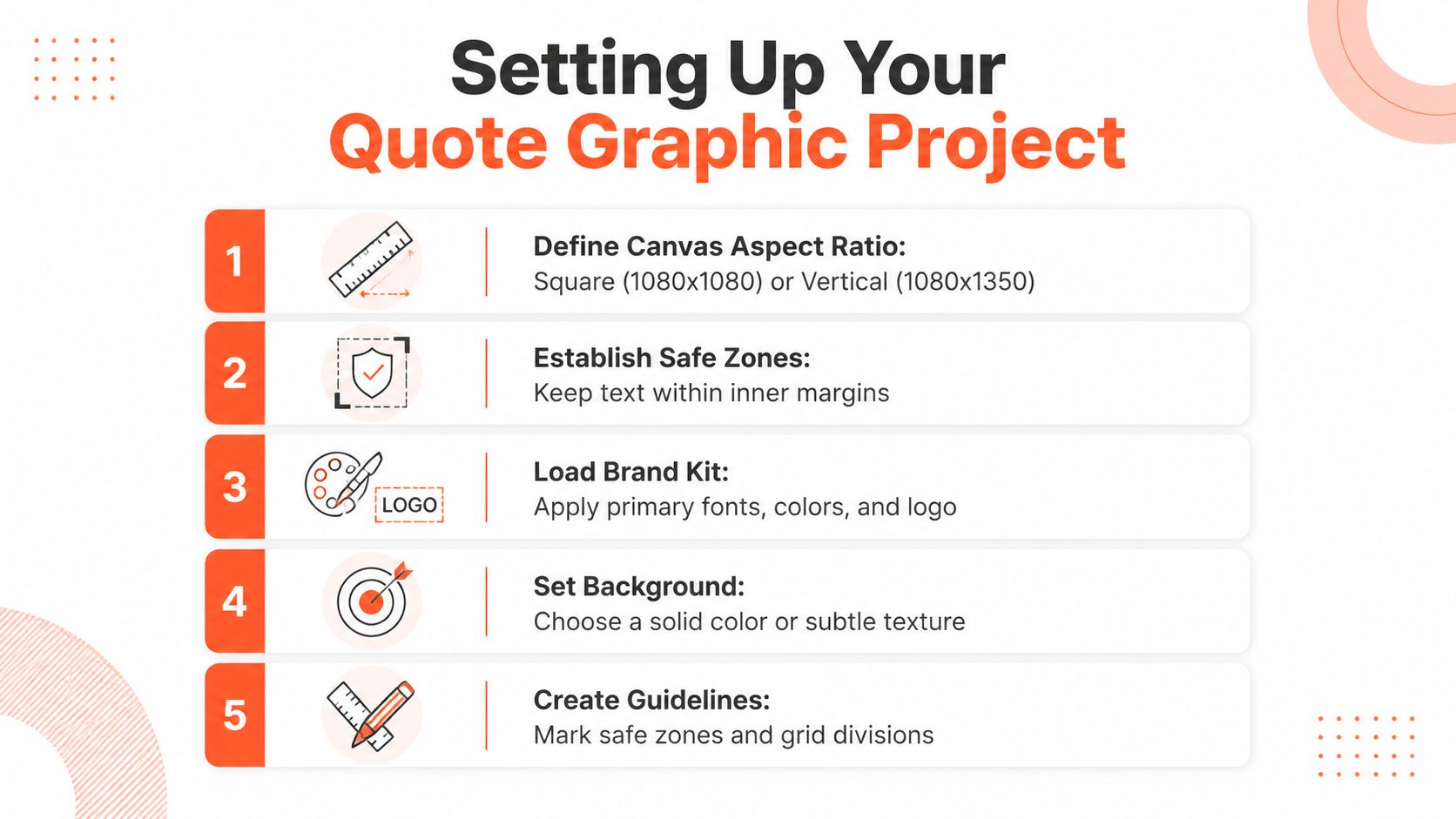
Design decisions become easier when you make them before opening the editor. Start with the primary canvas, because the aspect ratio controls your type scale, image crop, whitespace, and later adaptations.
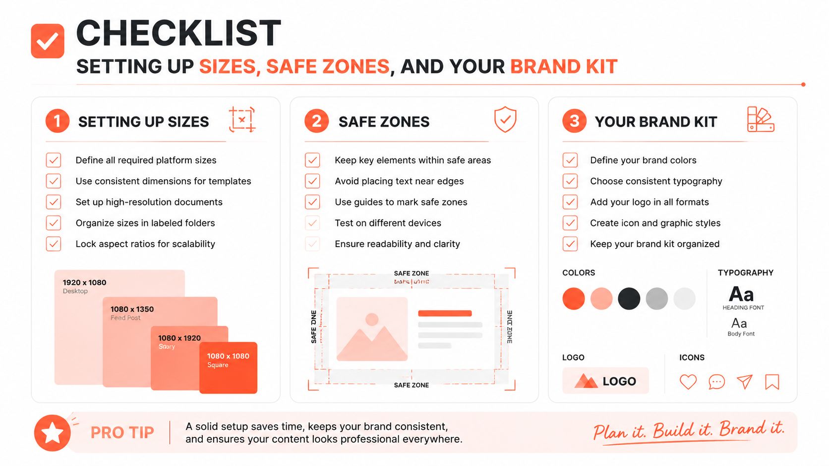
A square canvas at 1080x1080 remains useful for feed posts. A portrait canvas at 1080x1350 gives a quote more vertical room in a feed, while 1080x1920 is built for Stories, Reels, and TikTok covers. Use the starryai aspect ratio creator guide when you need a quick reference for how different ratios behave across social platforms.
Build the master file at the largest practical working size, then keep important content inside an inner safe area. A working margin of roughly 80 to 120 pixels keeps the quote away from profile handles, interface controls, reaction overlays, and crop risks. Treat those margins as part of the composition, not empty space you need to fill.
Turn the brand kit into an operating system
A useful kit should answer design questions without requiring a new discussion for every post. Keep these decisions in one accessible place:
- Backgrounds: Choose at least one light and one dark background option so your system works across different moods and viewing conditions.
- Accent color: Assign one accent role, such as a quotation mark, rule, highlighted word, or small label. Don't use every brand color on one card.
- Typography: Select a display treatment for the quote and a supporting treatment for attribution or context.
- Logo usage: Keep a light and dark logo variant, and test both at thumbnail size.
- Layout rules: Document preferred alignment, padding, image treatment, and attribution placement.
- File structure: Save the editable master separately from exported files, then name variants by source, platform, and publishing date.
For a fuller foundation, use this brand kit setup guide to organize fonts, colors, logos, and voice before you build reusable templates.
Your setup checklist is simple: choose the master ratio, mark the safe zone, load the brand assets, create light and dark versions, add alignment guides, and save a locked master. The payoff is consistency without creative paralysis. Once those decisions are stable, each new quote becomes an editing task rather than a fresh design project.
Typography and Color Choices That Earn Attention
A quote card can have a polished brand kit and still disappear in the feed. The usual cause is weak hierarchy: the quote, attribution, logo, and decorative treatment compete before the viewer knows where to look. Start with one typeface in two weights. Give the quote the stronger weight, then use the lighter or smaller weight for attribution. One family usually creates more control than mixing several fonts on a small canvas.
A geometric sans such as Inter or General Sans can pair with a restrained serif accent when the brand needs warmth. Staying within one sans-serif family gives a sharper editorial voice. Either route works if the reading order is obvious. The viewer should identify the quote first, the attribution second, and the source without searching.
Short words can tolerate a little more scale. Longer quotes need room for wrapping. For mobile layouts, set the main quote at roughly 8% to 12% of the canvas height as a starting point. Use line height near 1.2 for short lines and closer to 1.3 when the quote spans more lines. Check the design at actual feed size, because a type treatment that looks balanced at 100% in the editor may become unreadable as a thumbnail.
A practical pairing reference
| Element | Recommendation | Why It Works |
|---|---|---|
| Quote type | One display face, bold or semibold weight | Establishes an immediate reading priority |
| Attribution | Same family in a lighter weight, or a restrained companion face | Separates credit without competing with the quote |
| Accent | One word, rule, glyph, or label | Gives the eye a deliberate landing point |
| Background | Solid color, subtle texture, or controlled photograph | Supports the idea without competing with it |
| Line spacing | Near 1.2 for short text and 1.3 for longer text | Improves scanning and reduces cramped lines |
| Contrast | Test light and dark combinations before export | Prevents text from disappearing in real viewing conditions |
Color choices should support recognition and reading, not decorate every available space. A card that works on white can lose clarity against a dark interface or a compressed thumbnail. Test the text on both light and dark background treatments, then check whether emphasis still works without color alone. For deeper guidance on palette combinations, see this color psychology guide.
Accessibility adds a practical check to every palette decision. Image text needs descriptive alt text, and difficult combinations include red and green, purple and blue, and blue and green. UBC's accessibility guidance helps assess whether an attractive combination remains distinguishable for more viewers.
Keep the graphic concise when the quote carries the post. Put context, explanation, and extra detail in the caption. A Facebook image-post study associated easier-to-read text, longer copy, and more hashtags with engagement and awareness, and reported stronger results when text exceeded 31 words or 321 characters. The study summary on text and platform advertising includes the methodology and caveats. That finding does not call for turning a quote card into a paragraph. Let the image deliver the memorable line, while the caption handles the fuller message.
Layout Patterns That Make the Quote the Hero
The right layout depends on the quote, not on whichever template is open. Short statements need breathing room. Longer statements need structure. Photographic backgrounds need a contrast strategy, while solid backgrounds can carry more typographic personality.
Use outer padding between 8% and 12% of the canvas width as a starting point. Keep line height near 1.3 times the font size when mobile readability matters, and set attribution around 35% of the quote font size so credit remains visible without taking over.
Five patterns worth keeping
Centered single block: Use this for a short quote, ideally under 12 words. Center alignment works when negative space is doing most of the visual work. The common mistake is adding too many decorative elements and weakening the quiet impact.
Left-anchored asymmetry: Place the quote on the left and stack the attribution or source label toward the right. This creates movement and works well when you want the card to feel editorial rather than motivational.
Split-rule composition: Put the quote above a horizontal rule, then place the attribution, role, or short context line below it. This suits a quote in the 15 to 25 word range because the divider gives the text a clear stopping point.
Photographic background with a text box: Choose an image that supports the meaning, then place the quote inside a high-contrast panel. Don't lay white type directly over a detailed photograph unless you've checked every line at thumbnail size.
Editorial two-column treatment: Use one side for the quote and the other for a portrait, object, texture, or source detail. This is useful when the person behind the quote matters to credibility, but it requires strict alignment so the card doesn't feel split into unrelated pieces.
The quote typography tag on Hooked can help you study different arrangements before building your own system. Borrow the structural idea, not the entire visual identity.
Match the frame to the message. A short, definitive sentence benefits from open space and large type. A longer passage needs a measured column width, more line-height, and a clear attribution zone. If the background image is busy, simplify the typography. If the background is plain, let alignment, scale, and one controlled accent create the distinction.
Exporting and Repurposing Across Every Platform
A repurposing workflow begins with one editable master, not with six separate designs. Build the core composition on a portrait canvas at 1080x1350, then duplicate the file for square, Story, and other platform-specific crops. The master should preserve the quote, attribution, logo, background, and editable text layers so you can adjust the crop without rebuilding the card.
Export the visual assets in the format each destination handles well. Use PNG when you need crisp text and clean graphic edges, especially for Instagram or Pinterest. Use JPG when file weight matters more and the design doesn't rely on transparency. Keep a transparent version only when another workflow needs to place the card over a different background. Otherwise, flattening the artwork reduces accidental layer changes and makes publishing more predictable.
| Platform | Dimensions | Aspect Ratio | Format | Quality |
|---|---|---|---|---|
| Instagram feed | 1080x1350 | 4:5 | PNG | High-resolution export |
| Instagram square | 1080x1080 | 1:1 | PNG | High-resolution export |
| X cards | 1080x1080 | 1:1 | JPG or PNG | Crisp text rendering |
| Stories and TikTok covers | 1080x1920 | 9:16 | PNG or JPG | Check interface safe zones |
| Blog embed | 1200x628 | Wide landscape | JPG or PNG | Balanced file size and clarity |
The exact export requirement can vary by platform and publishing tool, so treat this table as a working production reference rather than a permanent specification sheet. Before scheduling, preview each crop inside the destination platform.
Build a repeatable three-step loop
- Export the master: Save the full editable version and the primary portrait asset.
- Create variants: Duplicate the master, reposition the quote within the safe zone, and export the square, Story, and wide versions.
- Queue the context: Prepare captions, attribution, hashtags, and platform-specific calls to action alongside the files.
A consistent naming system prevents the content library from becoming a landfill. Use a structure such as source-quote_platform_date_version, then store the editable master beside the exports. A distribution workflow such as multi-platform publishing can help coordinate captions and publishing when the same idea needs platform-specific treatment.
The goal isn't to force identical content everywhere. Keep the visual identity consistent, but adjust the crop, caption length, opening line, and call to action for the platform. That's how one quote becomes a useful content unit rather than a single post with nowhere else to go.
Making Quote Cards Look Less Like Templates
The highly polished template look has become easy to reproduce. AI tools and design platforms can generate smooth gradients, perfect shadows, and balanced type treatments quickly, which means polish alone no longer signals distinctiveness. Current design-trend coverage points toward paper-like surfaces, expressive typography, hand-made texture, and imperfect-by-design layouts as alternatives to generic digital perfection. Picsart's 2026 design trends coverage explores that shift.
The answer isn't to make every quote card messy. It's to introduce a visual decision that feels owned by your brand.
Try these substitutions:
- Add subtle paper grain or noise: Keep it restrained so the texture adds depth without weakening readability.
- Use a hand-drawn mark: A rough underline, small stroke, or imperfect circle can feel more human than a stock swoosh.
- Photograph your own backgrounds: A phone photo of a desk, wall, notebook, street, or workspace gives the card a source that stock imagery can't replicate.
- Make one word carry the emphasis: Keep the rest of the quote calm and use a bold weight or accent color on the phrase that changes the meaning.
- Break the centered grid: Shift the quote slightly off-axis, vary the margins, or anchor the attribution in an unexpected but consistent location.
Don't add a third typeface to create personality. Change the weight, crop, spacing, or texture first. Those adjustments usually create more distinction with less visual noise.
Cover the quote with your hand. If the background could belong to any account, redesign it before posting.
That test exposes generic execution quickly. Your card should remain recognizable through its texture, framing, photographic language, or recurring asymmetry. A branded editorial object doesn't need to shout. It needs to look intentional before the viewer reads the words.
Your Quote Graphics Checklist and Next Steps
A quote-card system should make quality control fast enough to use every time. Before publishing, check the asset rather than trusting the editor preview.
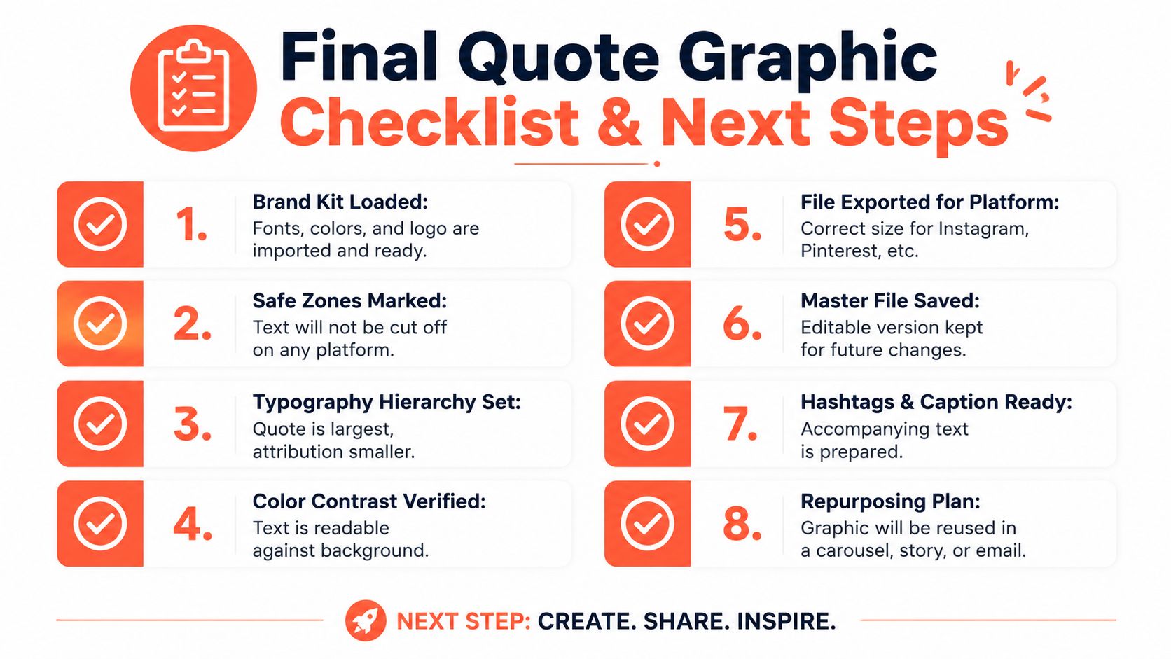
- Load the brand kit: Confirm the approved fonts, colors, logo variants, and voice settings are available in the master file.
- Mark safe zones: Keep the quote, attribution, and logo away from interface areas and crop edges.
- Set hierarchy: Make the quote the dominant element, then reduce the attribution and supporting details.
- Verify contrast: Test the text against the actual background, including light and dark viewing conditions.
- Export platform variants: Create the square, portrait, vertical, and wide versions from the same editable master.
- Save the source file: Preserve the layered version so the next quote requires editing, not reconstruction.
- Prepare the caption: Add context, attribution, accessibility text, and a relevant action for the audience.
- Plan the reuse: Mark whether the quote will return as a text post, carousel slide, Story frame, email pull quote, or video overlay.
Pick one evergreen quote from your content archive today. Build it in the master template, export the portrait, square, and vertical variants, then write the captions before you close the project. Tag every file with the source quote, intended platform, and date so your library stays searchable.
This process turns quote graphics into a weekly production system. You're not making one attractive image and hoping it travels. You're creating a consistent, accessible asset that can support several publishing moments without losing its identity.
WaveGen.ai turns articles, newsletters, podcast scripts, and transcripts into branded quote cards, carousels, captions, and other platform-ready social assets using your saved colors, fonts, logo, and voice. Visit WaveGen.ai to turn your next source piece into a reusable quote-graphic workflow and keep distribution moving without rebuilding every card manually.
quote graphics
social media design
brand kit
typography
content repurposing
Turn this kind of writing into a week of social content.
Paste a blog post, newsletter, or rough draft — WaveGen turns it into publish-ready carousels, captions, and slideshows for every channel.
No credit card · First posts in 2min