July 11, 2026
16 min read
How to Create a Brand Kit: A Step-by-Step Guide (2026)
Learn how to create a brand kit from scratch. This step-by-step guide covers voice, messaging, logos, colors, and a checklist to apply it everywhere.
You probably have brand pieces scattered everywhere right now. A logo file in one folder, two slightly different blues in old Canva designs, a website headline that sounds polished, and social captions that sound like someone else wrote them. That's normal for a first brand build, and it's exactly why a brand kit matters.
A useful brand kit doesn't have to be fancy. It has to be clear, usable, and easy for you or anyone you hire to follow. If you're learning how to create a brand kit for the first time, think of it less as a design exercise and more as an operating manual for how your business shows up.
Table of Contents
- Laying the Foundation Your Brand's Core Identity
- Crafting Your Brand Voice and Messaging
- Designing Your Visual Identity
- Curating Imagery and Graphic Elements
- Assembling Your Brand Kit Document and Assets
- Activating Your Brand A Practical Application Checklist
Laying the Foundation Your Brand's Core Identity
Most weak brand kits fail before design starts. The problem usually isn't the logo. It's that the business hasn't decided what it wants to be known for, who it's trying to help, or how it wants people to feel after an interaction.
Start with your purpose. Not the polished mission statement you think you should write, but the practical answer to a harder question: why does this business deserve to exist? If your answer is vague, your brand will look vague too.
Ask yourself:
- What problem do we solve: Name the pain point in plain language.
- Who feels that problem most acutely: Think in situations, not demographics.
- What do we want people to remember: Reliability, clarity, speed, warmth, rigor, creativity.
- What are we not: This matters as much as what you are.
A coach serving burned-out founders will build a very different identity from a consultant serving regulated industries. They may both offer advice, but the emotional expectations are different. One brand may need to feel calming and direct. The other may need to feel precise and steady.
Define your audience as a person in a moment
Avoid broad descriptions like “small business owners” or “busy professionals.” Those labels don't help you make brand decisions. A stronger audience description sounds more like this: “A solo consultant who knows their expertise is strong, but their online presence looks improvised.”
That kind of audience snapshot gives you something to design for. It shapes the language you use, the polish level of your visuals, and the kind of proof or reassurance your content should provide.
Practical rule: If your audience profile doesn't help you decide between two headlines, two colors, or two homepage images, it's still too generic.
Choose a brand personality you can sustain
Brand personality shouldn't be random adjectives pulled from a workshop. Pick traits you can live up to in content, client communication, and offers.
A short exercise works well here:
- Write down three traits you want your brand to project.
- Add one caution for each trait.
- Turn each trait into a behavioral rule.
For example:
| Trait | Caution | Rule |
|---|---|---|
| Clear | Don't sound cold | Use plain English, then add warmth |
| Expert | Don't sound arrogant | Teach directly, avoid jargon-heavy phrasing |
| Modern | Don't chase trends | Keep visuals clean, not gimmicky |
This is the strategic core of how to create a brand kit that feels coherent. When the foundation is right, your design choices stop feeling arbitrary. They start reinforcing a specific impression, repeatedly, across every channel.
Crafting Your Brand Voice and Messaging
Some brands look polished but sound inconsistent. Their website is formal, their email newsletter is conversational, and their social captions swing between motivational slogans and technical advice. That disconnect weakens trust faster than people realize.
Voice fixes that. It gives your brand a recognizable way of speaking, even when different people are writing.
Turn adjectives into writing behavior
“Professional but friendly” is a common starting point. It's also too loose on its own. A useful voice guide translates tone into choices.
Take these examples:
- A playful startup might use short sentences, casual phrasing, and light humor in product updates.
- A family law firm may still sound warm, but it should use calmer wording, fewer jokes, and more structured explanations.
- A high-end consultant might sound concise, assured, and selective, with strong verbs and little fluff.
The difference isn't just style. It's fit. Voice should match what your audience needs to feel from you.
Build message pillars you can reuse
Your messaging pillars are the themes you want to return to consistently. They help prevent random posting and uneven positioning. For a service business, three simple pillars are often enough.
Those might include:
- Your approach: How you work and what makes your process distinctive.
- Your outcome: What clients can expect to gain or experience.
- Your point of view: What you believe that others in your space often miss.
If your content team or freelance writer can't quickly identify which pillar a piece belongs to, the brand message probably isn't sharp enough yet.
Here's the contrast I often see.
Generic message:
“We help businesses grow with customized solutions.”
Sharper message:
“We help expert-led businesses turn scattered ideas into clear, trusted content that sounds like them and looks consistent everywhere.”
The second version says more. It hints at audience, problem, method, and value.
Write a value proposition that answers the buyer's real question
People want to know what's in it for them, but they also want to know whether you understand their current frustration. A useful value proposition combines both.
Try this format:
- Who you help
- What you help them do
- Without what common frustration
For example: “We help independent advisors publish consistent educational content without having to design every asset from scratch.”
That statement is easy to test. Put it on your homepage. Say it out loud in a sales call. Use it in your bio. If it keeps needing explanation, simplify it.
If you're refining short-form content at the same time, this guide to copywriting for social media is a useful companion because it helps translate voice into platform-specific writing choices.
Your best brand voice usually sits one step away from how you naturally speak at your clearest, not at your most casual and not at your most corporate.
A good voice guide should also include quick boundaries. Add a short “we sound like / we don't sound like” list. That single page can save a lot of rewriting later.
Designing Your Visual Identity
A founder approves a logo, picks a few colors, and feels done. Two weeks later, the social templates use a different blue, the website buttons look off, and the logo disappears on a dark background. That is usually the moment a business realizes visual identity is not a set of preferences. It is an operating system for design decisions.
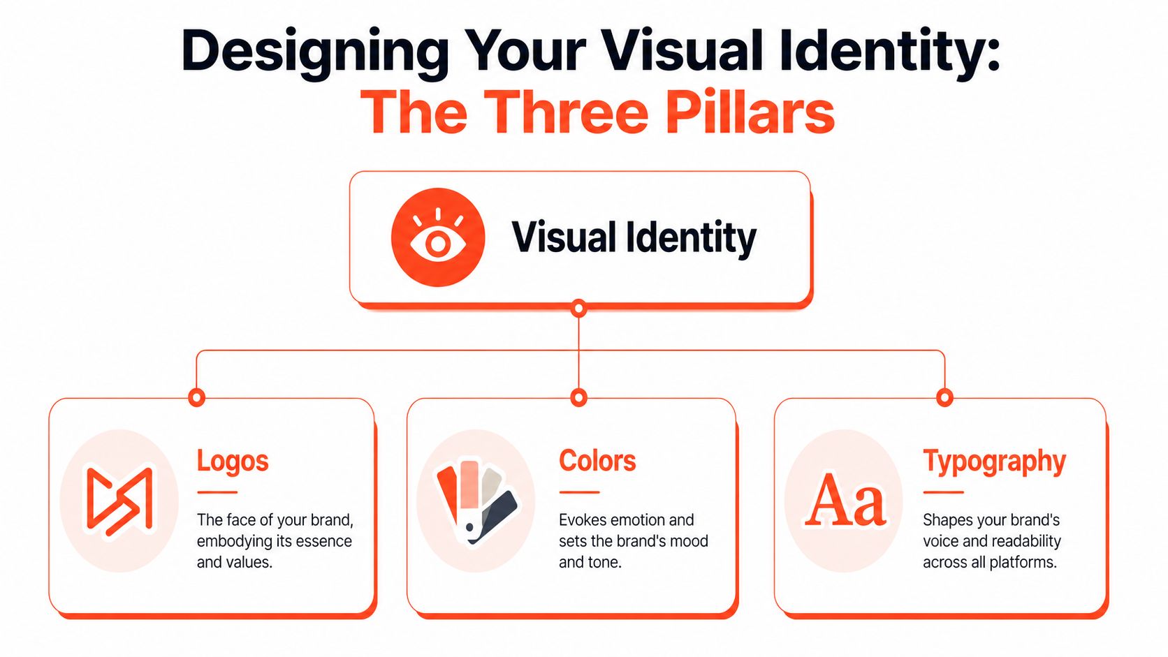
The goal is not to make everything look fancy. The goal is to make good choices repeatable across your website, sales deck, social posts, print materials, and any content your team creates later. A useful brand kit turns visual taste into clear rules other people can follow.
Decide what your logo system needs to do
Your logo needs to work in real conditions, not just in a polished mockup. That means planning for profile photos, website headers, footers, slide decks, invoices, packaging, and black-and-white use.
According to Miro's brand kit guide, 65% of initial brand kit drafts omit black-and-white logo variants, and failure to define color specifications like Hex and RGB contributes to many brand inconsistency errors across channels. The pattern is common. Early drafts focus on the attractive parts and skip the files and rules people need during everyday production.
For most brands, a practical logo system includes:
- Primary logo: The full version for standard placements
- Secondary or simplified logo: A cleaner variation for tighter spaces
- Icon or mark: Useful for social avatars, favicons, and watermarks
- Light and dark versions: For contrast across backgrounds
- Black, white, and monochrome versions: For print, sponsorship placements, and limited-color use
Document the rules too:
- Clear space: How much room the logo needs around it
- Minimum size: The smallest readable version
- Approved backgrounds: Solid colors, photos, or textures it can sit on
- Misuse examples: Stretching, recoloring, rotating, outlining, or adding effects
This part saves time later. If a freelancer, VA, or marketing hire has to guess which logo file to use, they will guess wrong eventually.
Build a color palette people can apply without asking for help
A color palette should do more than show swatches. It should tell your team what each color is for.
The strongest kits usually stay restrained. One to three primary colors is enough for most small brands, with a few secondary and neutral colors to support layouts, backgrounds, and calls to action. More options can feel creative at first, but they often create inconsistent pages and crowded graphics.
A workable structure looks like this:
| Color role | What to define | What to clarify |
|---|---|---|
| Primary | Exact Hex, RGB, CMYK, Pantone | Main brand color, button use, headline use |
| Secondary | Exact values | Backgrounds, highlights, supporting graphics |
| Neutral | Exact values | Body text, dividers, light backgrounds |
| Accent | Exact values | Calls to action, small emphasis moments |
Include usage notes in plain language. For example: "Use navy for headlines and buttons. Use sand only for backgrounds. Do not place white text on pale green." Those notes matter because the people using your kit are often writing posts, building slides, or updating landing pages under time pressure.
Accessibility belongs here too. If a color fails for text contrast, mark it clearly. Good brand control is not about limiting creativity. It is about removing avoidable mistakes.
For a more strategic view of how color choices shape perception, this article on color psychology in branding is worth reading.
If AI-generated visuals are part of your workflow, your palette rules need to carry over into prompts, references, and review standards. Resources on Achieving brand consistent visuals with AI can help you turn visual guidelines into repeatable production steps.
Choose typography that holds up in everyday use
Typography affects how polished, readable, and trustworthy your brand feels. It also breaks down faster than people expect when the wrong font gets used in the wrong place.
I usually recommend a simple system:
- A headline font with character
- A body font that stays readable at small sizes
- An optional accent font only if you have a specific job for it
That is enough for most businesses. More than that, and teams start mixing styles without meaning to.
Write down the practical rules. List approved weights. Set default sizes for headings, subheads, and body copy. Note whether the font is licensed for web, desktop, or commercial client use. If a font is hard to access, expensive to license, or unavailable in common tools, it will create friction and substitutions.
A typeface that looks refined in a logo can become a daily headache in proposal templates, webinar slides, and carousel graphics. Readability wins more often than novelty.
If you are building your first brand kit without formal design training, simplify hard here. Fewer logo variants, fewer colors, and fewer font choices usually lead to better consistency. More important, they make the kit easier to activate across every content workflow instead of leaving it as a document nobody uses.
Curating Imagery and Graphic Elements
Brands often get the logo right and the imagery wrong. The website feels polished, but the photos, icons, and illustrations look like they came from unrelated companies. That mismatch is one of the easiest ways to make a business feel less established.
A good brand kit should define the visual world around the core identity.

Build a mood board before you pick images
Start with a simple board in Canva, Figma, Milanote, or even a slide deck. Don't collect images because they look nice. Collect them because they reflect the personality and emotional tone you defined earlier.
Use prompts like these:
- Lighting: Bright and airy, natural and documentary, dark and dramatic, soft and premium.
- Subject matter: People, products, places, workspaces, details, textures.
- Composition: Clean negative space, close-up crops, editorial framing, symmetrical layouts.
- Emotional tone: Calm, ambitious, grounded, optimistic, high-touch.
When reviewing the board, ask a harder question than “Do I like these?” Ask, “Would someone recognize these as belonging to the same brand?”
Create rules for icons illustrations and patterns
Graphic elements need standards too. If you use icons, choose a consistent style. Outline icons and chunky filled icons usually don't belong in the same system. If you use illustrations, decide whether they are hand-drawn, geometric, flat, textured, or realistic.
Document a few choices:
- Icon style: Stroke weight, corner style, level of detail
- Illustration style: Abstract or literal, playful or restrained
- Patterns or shapes: Where they appear and where they don't
- Image treatment: Natural color, muted tones, overlays, or duotone effects
This doesn't need to be long. A page of examples is often more useful than several paragraphs of explanation.
The fastest way to weaken a strong brand is to let every blog header, slide deck, and social post use a different visual language.
If stock photography is part of your mix, keep an approved folder. Don't rely on memory. Teams do better when they can choose from examples that already fit the brand instead of reinterpreting taste every time.
Assembling Your Brand Kit Document and Assets
This is the point where strategy becomes usable. If your brand rules live in a designer's head, an old email thread, and three cloud folders, you don't have a brand kit yet. You have fragments.
The document should be easy to scan, easy to share, and hard to misread.
A complete kit also needs real files, not just screenshots of them. Consistent brand presentation across all platforms can increase revenue by up to 23%, and a complete kit should include downloadable assets such as .SVG, .PNG, .JPG, and .EPS so teams and contractors can apply the brand consistently, as noted in Ditto's guide to building a social media brand kit.
What to include in the document
A practical brand kit usually works best in this order:
Brand summary
Mission, audience, positioning, personality traits.Voice and messaging
Tone rules, approved language, value proposition, core messages.Logo usage
Variations, clear space, minimum size, unacceptable uses.Color system
Swatches, technical values, role of each color, accessibility notes.Typography
Font hierarchy, weights, replacements if a font isn't available.Imagery and graphic elements
Photography style, icon guidance, illustration examples, overlays or patterns.Applications
Social post examples, presentation slides, email signature, website UI examples.
If you want a useful reference for what that structure can look like in practice, this guide on how to create brand guidelines complements the kit-building process well.
How to organize the asset library
The document tells people the rules. The asset library gives them the pieces. Keep both in the same place.
A clean folder structure might look like this:
01 Logos
Primary, stacked, icon-only, black, white, monochrome02 Colors and templates
Palette reference, slide templates, social templates03 Fonts
Licensed files, web-safe alternatives, usage notes04 Photography and graphics
Approved images, icon packs, illustrations, textures05 Brand kit document
PDF version and editable source file
Naming matters more than people think. “Final-logo-new2.png” is how confusion starts. Use labels that tell a person exactly what they're opening.
For teams handling lots of content or multiple contributors, asset retrieval becomes a workflow issue, not just a design issue. Folders help, but digital asset practices matter too. FLYP's insights on digital assets are useful if you're thinking beyond a one-person setup and want a sturdier system.
After the document is drafted, it helps to see a real walkthrough of how these pieces are assembled and used in content operations.
Make the kit easy to maintain
Brand kits fail when they're too precious to update or too loose to trust. The middle ground is best. Keep a version-controlled master file, but review it whenever you add a new channel, hire a contractor, or notice recurring mistakes in content production.
Useful maintenance habits include:
- Assign an owner: One person should approve updates.
- Track changes: Note what changed and why.
- Archive outdated files: Don't leave old logos next to current ones.
- Test with a real task: Ask someone to make a post or one-pager using only the kit.
If they hesitate or ask repeated questions, the kit still has gaps. That's not failure. It's feedback.
Activating Your Brand A Practical Application Checklist
A brand kit only earns its keep when it changes daily behavior. Plenty of businesses create a tidy PDF, feel accomplished, and then go right back to off-brand decks, mismatched thumbnails, and social posts that don't look related.
Activation is where consistency starts to compound.
Start with your highest-visibility assets
Don't try to redo everything in one weekend. Update the places people see most often and where inconsistency is most obvious.
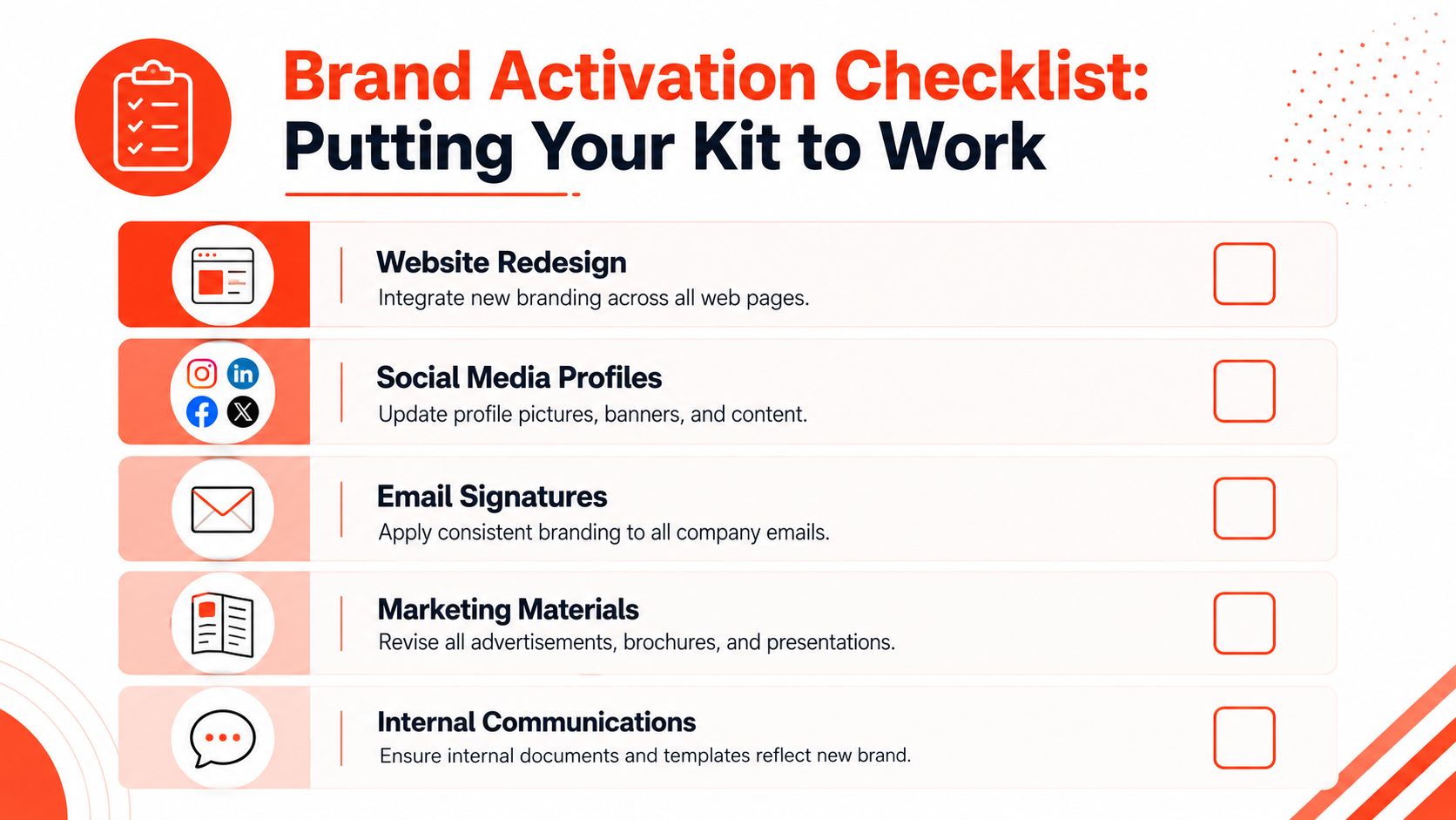
Use this checklist:
- Website essentials: Refresh your header, footer, buttons, form styling, and key landing pages.
- Social profiles: Replace profile photos, cover images, highlight covers, and bio messaging.
- Email signatures: Standardize logos, colors, titles, and links across the team.
- Presentation materials: Update slide masters, proposal templates, and workshop decks.
- Sales and marketing collateral: Revise one-pagers, brochures, lead magnets, and webinar graphics.
- Internal documents: Apply the brand to templates your team uses every week.
This step matters because people don't experience your brand as a document. They experience it through repeated touchpoints.
Build the kit into your weekly workflow
For most consistency problems, the outcome is either disappearance or persistence. If every new asset requires someone to remember the right font, hunt for the latest logo, and rewrite tone from scratch, your system depends too much on memory.
Instead, operationalize the brand:
- Save templates: Create approved layouts for posts, carousels, presentations, and PDFs.
- Preload assets into tools: Add your logo, fonts, color palette, and voice notes wherever your team creates content.
- Write micro-rules: Short reminders like “headlines are clear, not clever” or “accent color only for calls to action.”
- Review output in batches: It's easier to catch drift when you compare several assets side by side.
If you're using AI image workflows, guides that show how to create AI images with brand kits can help translate your visual rules into repeatable generation standards instead of one-off experiments.
A static brand kit helps on day one. A workflow-enabled brand kit helps every week after that.
The strongest kits are the ones people can use without overthinking. That's especially important if you publish often. Consultants, coaches, marketers, and small teams don't usually struggle because they lack ideas. They struggle because production gets fragmented.
If you've been learning how to create a brand kit, don't stop at compiling the document. Build the checklist into your operations. Add it to onboarding. Use it before publishing. Revisit it when content starts to drift. That's how brand consistency becomes practical rather than aspirational.
If you want a faster way to turn one article, newsletter, or transcript into a full week of on-brand social content, WaveGen.ai is built for exactly that. You set your brand kit once, including voice, colors, fonts, and logo, then generate platform-ready posts, visuals, and captions that stay consistent across channels. It's a practical fit for teams and creators who want their brand kit to function inside the content workflow, not sit untouched in a folder.
how to create a brand kit
brand identity
brand guidelines
visual branding
content marketing
Turn this kind of writing into a week of social content.
Paste a blog post, newsletter, or rough draft — WaveGen turns it into publish-ready carousels, captions, and slideshows for every channel.
No credit card · First posts in 2min