July 6, 2026
17 min read
Unlock Brand Power: Color Psychology in Branding
Master color psychology in branding. Discover how colors influence perception, pick a resonant palette, & build a memorable brand with real examples.
Most advice about color psychology in branding is too neat to be useful.
You've seen the formula. Red means passion. Blue means trust. Green means growth. Pick your mood, choose your swatch, and call it strategy. That advice survives because it's simple, not because it's reliable. In practice, color works more like positioning than fortune-telling. The same blue can feel secure, boring, premium, clinical, or forgettable depending on the category, the competitors on the screen, the product itself, and the audience reading the signal.
That matters because color isn't decoration. It shapes fast judgments before copy, features, or proof points have a chance to work. If your team treats color as a list of emotional clichés, you'll miss the two questions that matter most. First, does this palette make us meaningfully distinct from competitors? Second, does it signal what our product does?
Table of Contents
- Why Most Color Psychology Advice Is Wrong
- The Science of Color Perception and Brand Association
- A Practical Guide to Individual Color Meanings
- How to Build a Strategic Brand Color Palette
- Color Psychology Case Studies from Top Brands
- How to Test Your Palette for Accessibility and Impact
- Using Color to Build an Unforgettable Brand
Why Most Color Psychology Advice Is Wrong
The usual advice starts with the wrong question. “What does red mean?” sounds useful, but it treats color like a dictionary entry. Branding does not work that way. Color works more like a road sign placed in a specific location. Its meaning changes with the setting, the surrounding signals, and what people expected to see before they arrived.
A bright red “Buy Now” button on a quiet landing page can help the eye find the next step. Put that same red across a wealth management homepage and it can feel noisy, aggressive, or low-trust. Blue has the same problem in reverse. It often gets filed under “trustworthy,” yet in categories where every competitor uses blue, it stops signaling trust and starts signaling sameness.
That is why simple color charts create bad strategy. They encourage teams to follow category habits instead of making two harder judgments. First, does this palette help people understand what we do? Second, does it help them remember us instead of a competitor?
Color decisions carry real commercial weight. Amra & Elma's roundup of branding color statistics shows that consumers often form fast brand judgments based heavily on color, and that consistent color use can improve recognition over time. The practical lesson is straightforward. A weak palette does not just look generic. It makes recall harder and comparison easier.
Practical rule: Ask, “What will this color signal in this buying situation, in this category, beside these competitors, for this audience?”
That question matters most in crowded markets. Fintech, crypto, and SaaS teams often inherit the visual codes of the category without checking whether those codes still help the brand. This guide to Fintech and Web3 brand strategy is useful because it treats design choices as positioning choices, especially in sectors where visual sameness spreads fast.
A strong brand color choice has to clear three tests:
- Functional congruity: The palette should fit the product's job. A healthcare app, a children's toy brand, and a cybersecurity platform should not all signal utility in the same way.
- Competitive distinctiveness: The palette should separate you from nearby alternatives so buyers can spot and recall you.
- System durability: The colors should still work across product UI, sales decks, ads, packaging, email, and social content.
Many marketing teams get stuck on the first test and ignore the second. That is how brands end up “appropriate” but forgettable. The goal is not to pick the color that a generic chart says fits your category. The goal is to choose a palette that makes sense for your offer and gives buyers a clear memory of you.
The Science of Color Perception and Brand Association
Color does not persuade in the tidy, chart-based way many branding guides suggest. It works faster and messier than that.
People read color the way they read road signs, packaging cues, or app icons. In a split second, the brain uses color to guess what something is, what it does, and whether it belongs in a familiar category. That first pass happens before anyone forms a polished opinion about your brand.
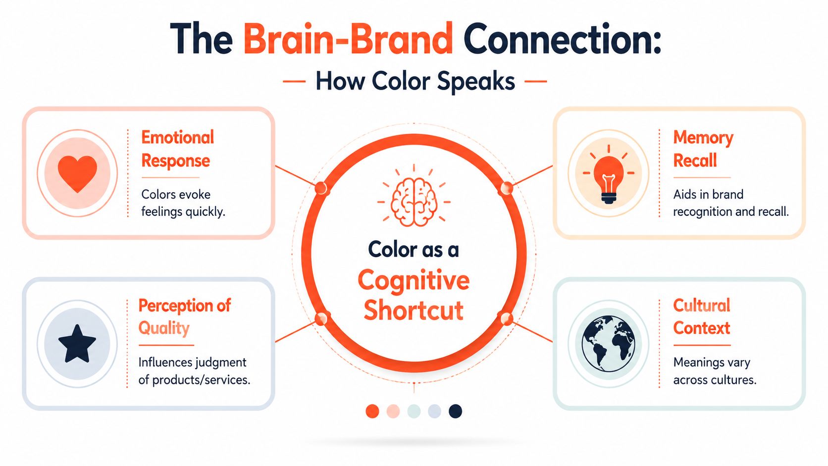
That is why brand color strategy starts with perception, not symbolism. The useful question is rarely “What emotion does this hue represent?” The better question is “What quick judgment does this palette trigger in the context where buyers will see it?”
Researchers who study color and marketing have repeatedly found that reactions depend heavily on fit. A color tends to work better when it feels suitable for the product, setting, and use case. Marketers often call this perceived appropriateness. I prefer a more practical term. Functional congruity.
Functional congruity means your palette should signal the job your offer is there to do. A project management tool can use bright, lively accents and still feel credible if the overall system communicates order and clarity. A luxury skincare brand can use muted neutrals because those colors support cues like refinement, calm, and ritual. A cybersecurity platform has less room for ambiguity. If its palette feels sugary, chaotic, or toy-like, buyers may question the product before they read a single feature.
A few examples make the principle clearer:
| Product or brand type | Useful color signal | What goes wrong when the signal clashes with the job |
|---|---|---|
| Cybersecurity software | control, precision, trust | the product feels lightweight or unserious |
| Organic food line | freshness, natural sourcing, care | the brand feels artificial or overprocessed |
| Kids learning app | energy, friendliness, encouragement | the experience feels cold or intimidating |
The point that trips up marketing teams is simple. Fit does not mean conformity.
A bank, insurance company, and B2B SaaS platform can all choose blue for sensible reasons, yet that does not make blue strategically strong for every new entrant. Once a palette clears the fit test, a second question matters just as much. Will anyone remember it?
Distinctiveness becomes a key factor. In perception research, unusual elements are often easier to notice and recall than ones that blend into the background. In branding, the same principle applies in a practical way. If every competitor on the comparison page uses navy, slate, and white, another navy palette asks buyers to do extra work to tell brands apart.
Distinctiveness is not decoration. It is memory support.
Consider fintech. Many firms choose blue because it signals stability and competence. That part makes sense. But if a challenger brand wants to look modern, useful, and trustworthy, it may get better results from pairing a stable base color with a sharper accent system that competitors are not using. The goal is not to be weird. The goal is to be easy to spot and easy to recall while still looking fit for purpose.
That balance is the essential scientific lesson. Brand association forms through repeated exposure to cues that feel coherent, useful, and recognizably yours. Color helps create that cue system, but only when it does two jobs at once. It must help buyers classify the offer correctly, and it must help them separate your brand from the pack.
A color can suit the category and still weaken the brand if it makes you visually interchangeable.
A Practical Guide to Individual Color Meanings
Use color meanings as prompts, not laws
You still need a working vocabulary. Marketers can't build a palette from pure abstraction. But use color meanings the way a strategist uses audience personas. They're starting points, not facts of nature.
A color carries common associations, possible downsides, and cultural variation. That last part is where many guides fail. A meaning that feels obvious in one market can feel weak, dated, ceremonial, or confusing in another. Even within one region, the same color can shift meaning by industry. Green in food and green in finance don't do the same job.
A working color dictionary
Use this as a practical reference, then pressure-test it against your audience and category.
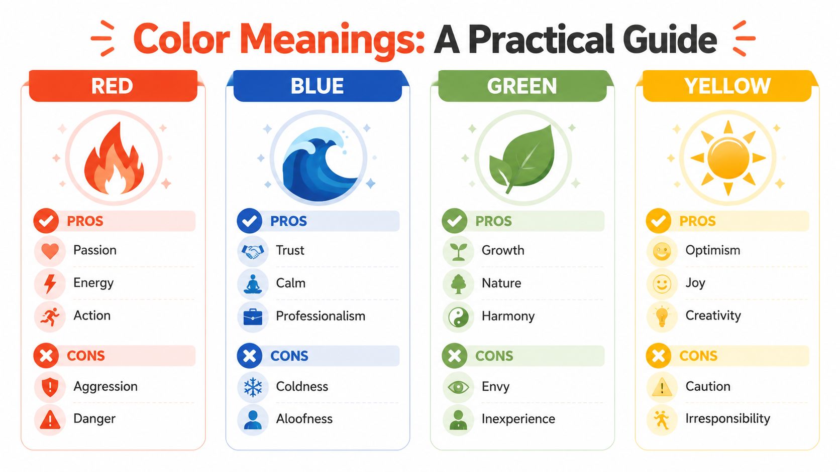
Red often signals energy, urgency, appetite, action, or boldness. It can also suggest danger, aggression, heat, or discount-store noise. In some contexts it sharpens impulse behavior, especially in promotional settings, but it can overwhelm brands that need calm or deliberation.
Blue commonly suggests competence, calm, security, cleanliness, or professionalism. That's why it appears so often in finance and technology. Its weakness is overuse. In crowded B2B categories, blue can make a new entrant feel interchangeable unless the shade, contrast, or system around it creates a distinct signature.
Green tends to point toward nature, health, renewal, sustainability, money, or balance. It can also drift into cliché if the brand leans too hard on “eco” symbolism without substance. Inexperience and envy also sit in green's shadow, which matters in premium or technical positioning.
Yellow often feels optimistic, visible, cheerful, or inventive. It also carries caution and can become tiring when overused in large fields. Many teams like yellow as an accent for alerts, highlights, or moments of delight rather than as the whole identity.
Working mindset: Ask what a color unlocks, what it risks, and where it already appears in your market.
Orange usually reads as warm, active, social, accessible, or sporty. It can feel less formal than red and less childish than some bright yellows. The downside is that it can reduce perceived seriousness if the product relies on authority or precision.
Purple often carries creativity, imagination, premium flair, or eccentricity. Some brands use it to signal originality without the aggression of red. It can also feel theatrical or detached from function if the product promise is practical and utilitarian.
Black can communicate elegance, authority, luxury, restraint, or edge. It also risks heaviness, distance, or sameness, especially in direct-to-consumer branding where too many premium brands now default to black-and-white minimalism.
White suggests simplicity, cleanliness, space, and clarity. But white rarely works alone. It usually needs another color to tell people whether the brand is clinical, modern, playful, or high-end.
Cultural context still matters across all of these. So does age, design style, and product category. A wise team treats color meanings like hypotheses to test, not truths to obey.
How to Build a Strategic Brand Color Palette
A strong palette starts with strategy, not preference. The useful question is not, “Which colors feel exciting to us?” It is, “What should a customer understand in the first two seconds?”
Color works like packaging on a shelf. Before anyone reads a headline, compares features, or watches a demo, the palette has already framed the offer. The American Marketing Association notes in its article on using color psychology in marketing that color strongly shapes first impressions, especially when it feels appropriate for the product itself.
That idea matters more than the usual “blue means trust” advice. A family budgeting app needs colors that suggest clarity, safety, and control. A video editing tool can support more energy and experimentation. A legal-tech platform that looks like a gaming brand creates friction. A kids coding app that looks like corporate tax software does the same. Functional congruity decides whether the brand makes sense before the copy has a chance to help.
Distinctiveness matters too. Many teams copy the dominant color in their category because it feels safe. That often produces the opposite result. Safe choices disappear into the category wall. If every cybersecurity brand uses the same dark blue, a well-chosen green, violet, or high-contrast neutral system can make your brand easier to spot, easier to remember, and easier to separate from lookalike competitors. Distinct does not mean random. It means recognizably different while still fitting the job.
A practical palette usually needs three roles.
Base color
This carries recognition across the logo, primary brand surfaces, and major layouts. It is the color people start to associate with your name.Accent color
This handles emphasis. Calls to action, key stats, highlights, and active states often live here because they need to catch the eye quickly.Neutral support
These colors make the system usable. Backgrounds, body text, dividers, forms, and secondary interface elements need restraint so the brand can stay clear without becoming noisy.
That structure keeps teams from treating every color like a star player. A good palette works more like a cast. One lead, one strong supporting role, and a few dependable characters that keep the story coherent.
A short demo helps clarify how palette roles work in practice.
One more test helps before you finalize anything. Lay your proposed palette next to the top five competitors in your market. Then ask two blunt questions. Does this look appropriate for what we sell? Does this look recognizably ours? If the answer to either question is no, keep refining. For teams exploring stylized contrast pairings, it can help to explore teal and orange aesthetics as a lesson in how color combinations create a distinct visual signature without abandoning clarity.
Once the palette is chosen, document it with precision. Brand consistency breaks when teams rely on screenshots, memory, or whatever looked close enough in Canva last week.
Specify exact HEX, RGB, and CMYK values. Define where each color appears and where it should not. Record approved button states, text pairings, background combinations, chart colors, and image treatments. If your team needs a model for that process, this guide on how to create brand guidelines gives a practical structure.
The palette is finished when a designer, marketer, product manager, and freelance contractor can all apply it the same way without guessing.
Color Psychology Case Studies from Top Brands
Color psychology gets weaker, not stronger, when teams treat it like a fixed dictionary. Red does not automatically mean passion. Blue does not automatically mean trust. In actual markets, color works more like positioning shorthand. It helps buyers sort brands fast. The better question is not, "What does this color mean in isolation?" It is, "What does this color signal in this category, next to these competitors, for this specific use?"
Shell and BP make that clear. Both operate in energy, but they do not benefit from looking interchangeable. Shell's red and yellow are high-visibility, bold, and hard to miss from a distance. BP's green and yellow push in a different direction and suggest a different stance. The lesson is not that one palette is more persuasive. The lesson is that distinction has strategic value when customers are scanning quickly and remembering imperfectly.
Fintech shows the same pattern. Wise uses green in a way that supports money movement and practical clarity. Revolut sits in darker blue and purple territory, which gives the brand a more digital and premium feel. Each palette shapes expectations before the interface, pricing, or copy does any work.
Functional congruity matters just as much. A color system should fit what the product helps people do. That is why many science-led skincare brands use white and cool blue to signal precision, cleanliness, and clinical utility, while premium skincare brands often choose black, cream, or muted neutrals to suggest ritual and status. Both can succeed. They succeed for different reasons.
A useful analogy is retail signage. A luxury hotel, an airport, and a children's museum should not all sound the same from the street. Color behaves the same way in branding. It needs to be recognizable, but it also needs to point people toward the right expectation.
Study your market with that lens:
Map the dominant category colors
Capture the top competitors across web, app, packaging, and paid ads. Patterns usually show up fast.Ask what job the color is doing
Is the palette signaling safety, speed, low price, technical precision, sustainability, or premium service?Look for distinctive territory that still fits the offer
Difference helps memory. Difference without fit creates friction.Review the full brand system
A logo can look original while the website, charts, social posts, and product screens still blend into the category. Teams producing assets at scale should study visual content creation workflows because color consistency often breaks in execution, not in the strategy deck.Check utility, not just mood
If a productivity app looks playful but hard to use, or a health brand looks premium but not credible, the palette is sending the wrong signal.
If you want to sharpen your eye for how color pairings create mood, contrast, and tone in visual culture, it can help to explore teal and orange aesthetics. Not because your brand should use that pairing, but because studying strong visual oppositions trains you to see how palettes shape meaning.
The strongest case studies rarely prove that one hue "wins." They show that strong brands choose colors that do two jobs at once. They stand apart from competitors, and they make the brand feel appropriate for its actual use.
How to Test Your Palette for Accessibility and Impact
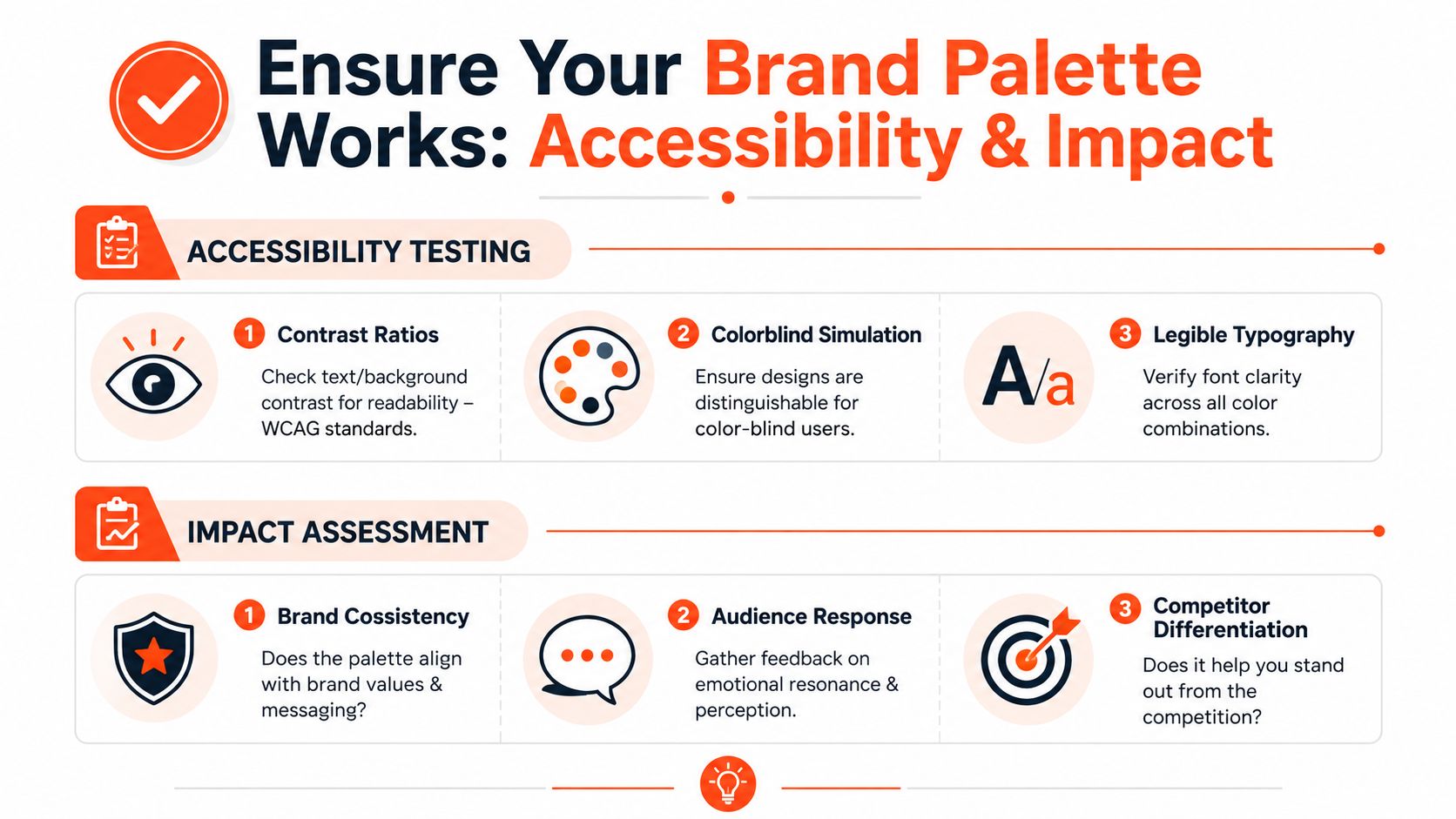
A strong palette earns its keep under pressure. Brand teams often approve colors in a polished deck, then discover the system breaks on a phone screen, in a sales chart, or on low-quality print stock. Testing catches that gap early.
Check usability before preference
Start with function. If people cannot read, scan, or act, the palette is underperforming, no matter how distinctive it looks.
Color in a brand system works like signage in an airport. It has to guide people quickly, under imperfect conditions, with distractions all around. A beautiful sign that no one can read is still a bad sign.
Use a checklist like this:
Check contrast across the whole system
Review text on every background, not just the hero section. Buttons, captions, error states, footer links, and data visualizations are where weak contrast usually shows up first.Simulate color vision differences
Test UI screens, ads, and social templates in colorblind simulators. Status, urgency, and success should never rely on hue alone. Shape, labels, and icons need to carry part of the message.Test at real sizes and real distances
A color pair that looks refined in a style tile can blur on mobile or disappear in a presentation viewed from the back of a room.Check the palette in motion
Hover states, disabled buttons, selected tabs, and progress indicators need enough separation to feel obvious, not subtle.
Good branding widens access.
If your team creates assets across channels, this guide to visual content creation workflows is useful because palette problems often appear in production, not in the original concept.
Test impact in context
After usability, test whether the palette helps the brand get recognized and understood in the places buyers encounter it.
Many color guides remain too shallow. They ask whether a color feels exciting or trustworthy. A better test asks two harder questions. Can people spot your brand quickly among competitors? And does the palette make the product feel fit for its job?
Run a simple evaluation grid:
| Test area | What to examine | What to watch for |
|---|---|---|
| Landing pages | primary CTA, secondary CTA, trust sections | clear hierarchy and obvious next actions |
| Social content | template consistency, thumbnail readability | whether posts are recognizable in-feed before the logo is noticed |
| Sales materials | charts, tables, key callouts | whether information feels clear, credible, and easy to scan |
| Print samples | color shift, paper interaction | whether the palette still feels appropriate and recognizable offline |
Then add one practical exercise. Put your homepage, ad, or package beside three competitors and blur your eyes for a second. Which one jumps out first? Distinctiveness often shows up faster in comparison than in isolated review.
Next, ask people what the brand seems to do. A cybersecurity company should not look like a candy brand. A budgeting app should not look vague or ornamental. This is functional congruity in practice. The colors need to support the product's role, not just create a mood.
For reference points, the Superdesign brand identity library is useful for studying how different palettes change perceived utility, category fit, and memorability across real brand systems.
Preference tests can help, but they should come last. A palette is doing its job when it stays usable, stands apart from the category, and signals the right kind of value.
Using Color to Build an Unforgettable Brand
Strong brands don't use color as ornament. They use it as a signal system.
That means dropping the childish version of color psychology in branding. Red isn't automatically passion. Blue isn't automatically trust. A useful palette does two harder things well. It helps the right audience understand what the product is for, and it helps them remember the brand apart from lookalike competitors.
That's why distinctiveness and functional congruity matter so much. One gives you mental availability. The other gives you clarity. Put them together and color stops being a design afterthought. It becomes part of your positioning.
If your team wants fresh visual references while building or refining that system, the Superdesign brand identity library is a solid place to study how different identity choices create very different brand impressions. And if you're tightening the fundamentals first, this guide on what is a brand kit is a practical companion.
Choose colors that fit the job. Choose them boldly enough to be remembered. Then use them with discipline.
Once your palette, fonts, and voice are defined, WaveGen.ai helps you apply them consistently across social content without rebuilding every post from scratch. It turns one core piece of content into on-brand assets for multiple platforms, which is exactly where many teams lose visual consistency after doing the strategy work right.
color psychology in branding
brand identity
brand colors
marketing psychology
visual branding
Turn this kind of writing into a week of social content.
Paste a blog post, newsletter, or rough draft — WaveGen turns it into publish-ready carousels, captions, and slideshows for every channel.
No credit card · First posts in 2min