August 9, 2026
13 min read
Carousel for Photos: How to Build One People Actually Swipe
Learn how to create a carousel for photos that grabs attention and drives engagement with proven design tips for 2026.

You've got the folder open already. Thirty decent photos. A deadline. A vague sense that this should be easy, yet every time you drag images into a template, the set starts to feel like a slideshow instead of something people want to swipe.
That's the core problem with a carousel for photos. Many treat it like a layout job, when the result depends much more on sequence, pacing, and where the post is going to live. A strong carousel is a distribution asset, not just a pretty stack of images.
Table of Contents
- The Carousel Mindset Before You Open Any Editor
- Preparing Your Photos for a Clean Carousel Build
- Sequencing Slides and Writing Hooks That Earn the Swipe
- Platform-Specific Publishing for Instagram, LinkedIn, and Your Website
- Building a Repeatable Carousel Workflow With Templates and Brand Kits
- A One-Week Carousel Plan and the Metrics That Actually Matter
The Carousel Mindset Before You Open Any Editor
A photographer dumps a folder of 30 event shots onto a designer's desk. A founder wants something “clean” by lunch. A social manager has ten usable images and no appetite for another round of revisions. That's usually where the wrong conversation starts, because the first decision isn't which font to use. It's which story the set can tell.
The old carousel for photos format has a long lineage. Slide projection goes back to the 17th century magic lantern, then moves through 1850 with the Langenheim brothers' Hyalotype, an early photographic slide technology, before Kodak's Carousel made slide sequencing easy to repeat in the 1960s. That history matters because the format has always rewarded a simple principle, one image should lead to the next, and each next image should earn the previous one. Kodak's Carousel even supported repeatable playback and sound synchronization, which is a good reminder that pacing was part of the product, not an afterthought. Legacybox's history of photo slides and Sarlin's Kodak Carousel overview both show how the format evolved around sequence, not isolated frames.
Read the folder as a narrative, not an archive
Start by sorting images into three jobs.
Practical rule: the first slide makes the promise, the middle slides keep that promise moving, and the final slide pays it off.
That means the cover shot is not always the best-looking image. It's the image with the clearest tension, question, or outcome. If you have a set from a product shoot, the opener might be the wide scene that hints at use, not the cleanest close-up. If you're working from a personal event, the opener might be the one frame that makes someone ask what happened next.
From there, pick only the images that advance the arc. A useful sequence is lead, context, proof, variation, payoff. If a frame repeats information, it gets cut. If a frame changes the mood, adds a useful detail, or sets up the next slide, it stays.
The easiest way to test the set is to lay out the candidate images as thumbnails and read the post as a story, not as a gallery. If the order makes sense without needing to stop and explain each picture, you've probably got the right spine.
Preparing Your Photos for a Clean Carousel Build
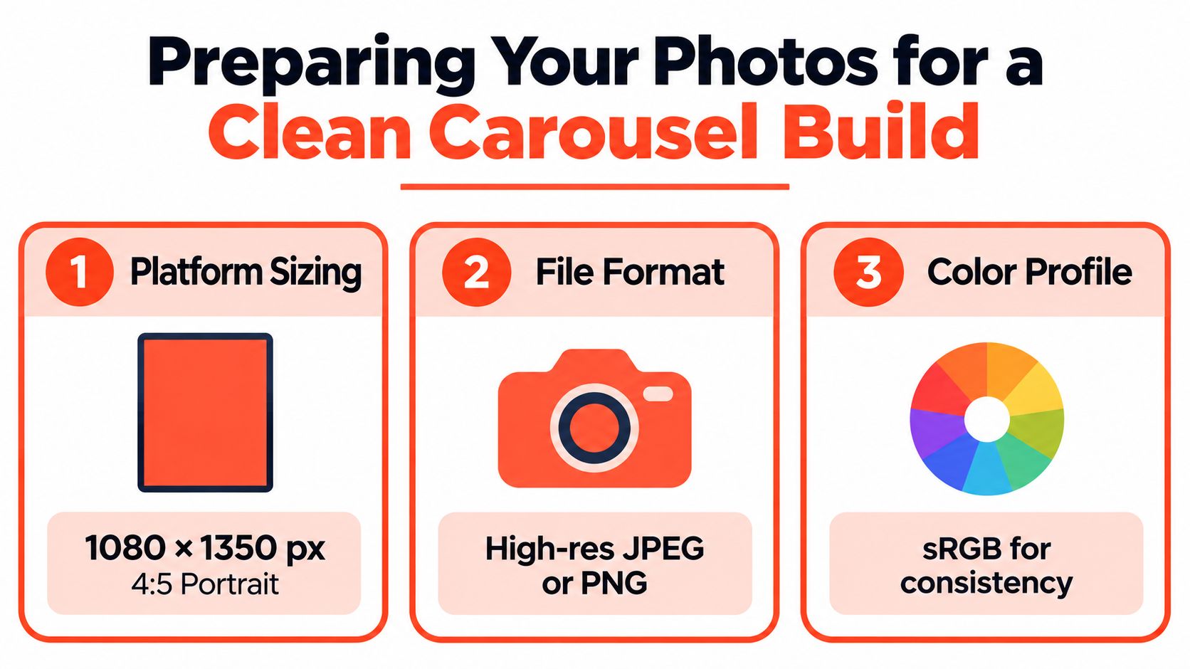
The cleanest builds start before design software opens. If the images are mismatched, soft, or exported in the wrong color space, the carousel feels off no matter how strong the copy is. For Instagram, the safest working canvas is 1080 × 1350 px in a 4:5 portrait ratio, because the platform crops subsequent slides to match the first slide's ratio. If you want a quick reference for other social sizes, the ideal image dimensions for socials resource is useful when you're mapping one asset across multiple placements.
Lock the format before you touch the layout
Use one master size and keep every slide aligned to it. Instagram supports up to 20 items in-app, while schedulers and API tools may be limited to 10, so the working file should still stay consistent even if the publishing path changes. For Facebook and Meta carousel ads, the technical baseline is 2 to 10 cards, with recommended creative at 1080 × 1080 px for square cards or 1080 × 1350 px for vertical cards. Meta also permits 9:16 in some placements, and its own guidance allows a 3% aspect-ratio tolerance on Facebook, which matters when assets are generated in bulk. Meta's carousel ad guidance is the reference to check when a campaign has multiple placements.
For export, use PNG for text-heavy slides and JPG for photo slides. Keep sRGB and 72 DPI as the default social settings, since higher DPI won't improve feed rendering. The practical file ceiling is under 8–30 MB depending on platform constraints, so don't save a massive file just because it looks good on a desktop monitor.
Practical rule: if the source image is too small, don't upscale it and hope for the best. Blurry source material stays blurry, it just gets larger.
Watch the two failure modes that waste the most time
The first is the low-resolution upscale. Anything below about 600–1080 px starts to break down fast once it's stretched into a feed-first canvas. The second is inconsistent aspect ratios across the set, which triggers silent cropping and creates that messy feeling where one slide suddenly looks tighter than the rest.
When I'm cleaning up a batch, I rename files by sequence before export. That sounds small, but it prevents a cover shot from getting buried and makes revision rounds much easier. It also helps when a post needs to be re-used later as a story set, a LinkedIn document, or a website slider. The asset lives cleanly in your digital asset library workflow instead of sitting as a one-off folder full of “final_final_2” files.
Sequencing Slides and Writing Hooks That Earn the Swipe
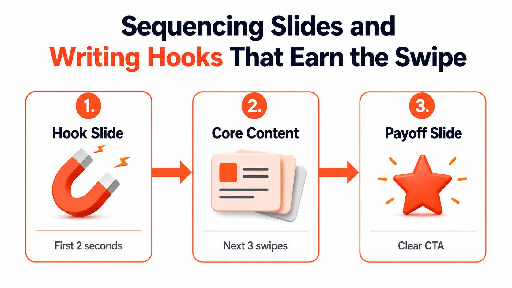
The first slide has one job, make the swipe feel necessary. Social platforms don't reward nice sequences that fail to create momentum. They reward posts that create curiosity fast, then keep it alive through the next few slides. That's why the cover needs a promise, not a summary.
Use a simple arc that the eye can follow
The most dependable structure is hook slide, core content, payoff slide. That's true whether the set is photo-only or mixed with text, and it's why carousel posts are often more effective when the order is planned around attention rather than around image quality alone. A question, a before-and-after, a bold claim, or a specific result all work because they create an opening. A polished gallery image does not automatically do that.
The cover slide should make a promise the final slide can keep.
For a photo-only carousel, the hook has to come from the image itself and the title text on top of it. In that format, I look for a frame with either motion, contrast, or an unusual crop. For a mixed set, the first slide can carry more of the message because the later slides can carry context. For a tutorial-style sequence, the hook should state the outcome directly, then the slides show the steps in a way that feels inevitable.
A quick read-aloud test catches weak sequencing. Paste the slide captions into a list and read them top to bottom. If the story still makes sense, the post is probably working. If the captions only make sense when the images are visible, the sequence is too dependent on design and not strong enough as a distribution asset. That matters on feeds where people skim before they commit.
Pick hooks that match the platform
Instagram usually tolerates a sharper hook, especially when the first slide is visual. LinkedIn responds well to clarity and specificity, because the audience is often scanning for relevance rather than novelty. A question works when the post solves a real friction point. A number works when it gives the reader a structure to expect. A before/after works when the visual difference is the point.
For creators who build their captions and slide copy in the same pass, a copy-first workflow helps. The copywriting for social media approach is useful here because the slide sequence and the caption should reinforce each other, not compete. If the final slide asks for action, the earlier slides should already have earned enough trust to make that action feel natural.
Platform-Specific Publishing for Instagram, LinkedIn, and Your Website
A carousel can look finished and still underperform if the export does not fit the place where it is published. Instagram is built for fast swipes. LinkedIn treats the same sequence more like a document people open and skim. A website slider has to stay light enough to load quickly, or the content feels slower than the page around it. The publishing choice affects reach, reading behavior, and whether the post survives the platform's own cropping and file handling.
| Platform | Canvas Size | File Format | Item Limit | Best Use Case |
|---|---|---|---|---|
| 1080 × 1350 px 4:5 portrait baseline | JPG for photos, PNG for text-heavy slides | Up to 20 in-app, schedulers may be limited to 10 | Swipeable storytelling, tutorials, photo sequences | |
| PDF document format is the common carousel path | Platform document uploads can go up to 100 MB, and the general file ceiling is often discussed as 300 MB in platform guidance | Thought leadership, frameworks, longer-form educational posts | ||
| Website slider | Responsive image set, matched to the page layout | JPG or PNG, depending on text density | Site-specific | Product storytelling, portfolio, homepage modules |
The table above is only useful if it changes how you build. If you are making a carousel for an audience that may only see it on one platform, start with that platform's native behavior and export from there. If you need a broader planning framework, our guide to social media carousels covers how sequencing and format choices change the way people swipe, pause, and share.
Match the export to the destination
Instagram rewards creative that feels native to the feed. Keep the first slide locked to 4:5, and keep the rest of the set visually consistent so the crop does not cut into the message. That matters more than people admit. A carousel with strong pacing can still lose impact if the top and bottom margins shift from slide to slide, because the eye reads that inconsistency as noise.
LinkedIn needs a different export mindset. The carousel often behaves like a readable document, so the slides should carry larger type, a cleaner hierarchy, and enough margin that the page still reads during a quick scroll. If the text only works at full zoom, it is too small for the feed. If every slide tries to behave like a poster, the document feel gets lost.
Website sliders are the least forgiving place to be sloppy about file weight and layout. A heavy hero slider slows the page down, and motion does not compensate for a weak information structure. If the slider lives on a homepage, the creative has to support the page's job, not compete with it. That is why many teams keep web carousels lightweight and use animation only where it makes the point easier to grasp.
For production teams that need to batch multiple post variants, a MerchLoom batch image workflow is worth studying because it shows how a repeated visual system can cut rework without forcing every card to be rebuilt from scratch. The same approach applies when one source set needs to become an Instagram post, a LinkedIn document, and a website module. It also keeps approval loops shorter, which matters more than the design polish people usually obsess over.
Do this, not that
- Do this: export one preset per platform and reuse it.
- Not that: rebuild the same carousel from scratch for every channel.
- Do this: write for the destination first, then adapt the copy.
- Not that: paste the same caption or document text everywhere.
- Do this: check the item limit before you promise a slide count.
- Not that: assume every publishing path accepts the same geometry or file size.
Building a Repeatable Carousel Workflow With Templates and Brand Kits
The fastest way to publish more carousels is to stop treating each one like a bespoke design project. Once a brand kit is locked, the work becomes operational. Colors stay fixed, typography stays fixed, spacing stays fixed, and the team spends its energy on what changes, the message and the sequence.
Build the system once, then let content feed it
A usable carousel pipeline starts with two or three reusable templates. One should be built for a cover hook, one for dense information, and one for the payoff or CTA slide. After that, every new source asset should pass through the same path, article, podcast transcript, webinar notes, or a YouTube script turned into a draft set, a caption, and a platform-specific export.
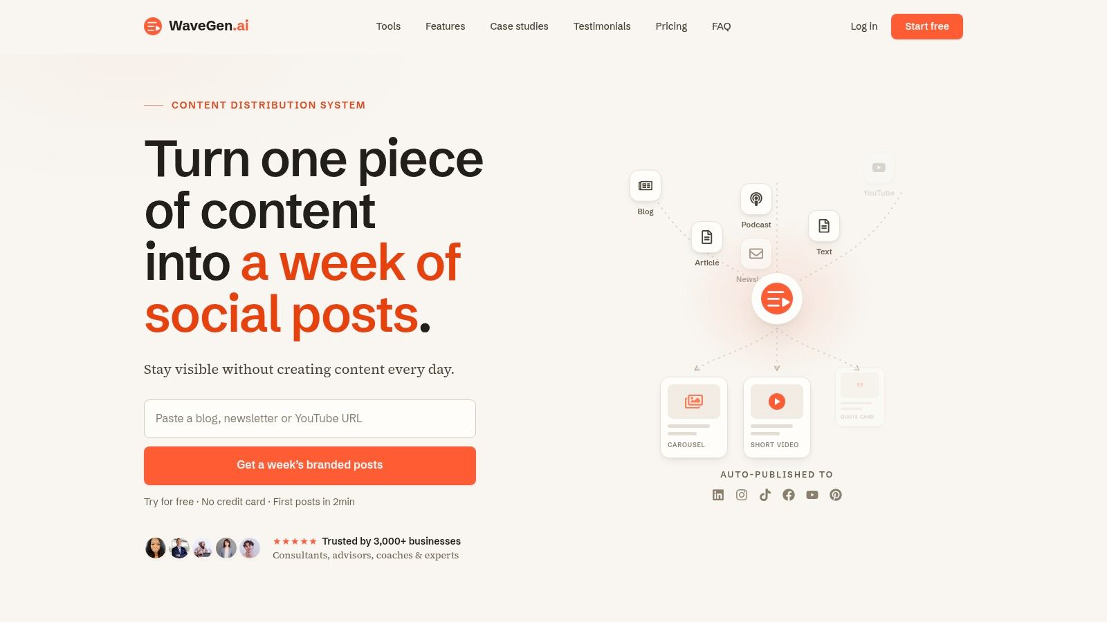
WaveGen.ai is one tool that handles that kind of repurposing by turning source content into carousels, captions, and hashtags with platform formatting, then letting a visual editor adjust text and images before publishing. It also supports scheduling and crossposting, which matters when the goal is to keep output consistent rather than to produce one isolated post. For teams juggling multiple brands, that kind of repeatable structure is usually easier to manage than manual collage work.
Practical rule: templates should reduce decisions, not flatten the content.
The question is not whether AI-assisted batch generation replaces judgment. It doesn't. The question is whether it removes enough repetitive formatting work that the designer can spend more time checking hierarchy, image quality, and the actual story arc. When a team is producing for several brands at once, the win is consistency, not sameness.
A visual editor helps because the first draft is rarely the last draft. Someone still needs to tighten copy, swap images, and check that the cover slide promises something the final slide can deliver. Batch generation earns its keep when it gets the team from blank page to editable draft fast. The finishing still belongs to a human who knows what the brand should sound like.
A One-Week Carousel Plan and the Metrics That Actually Matter
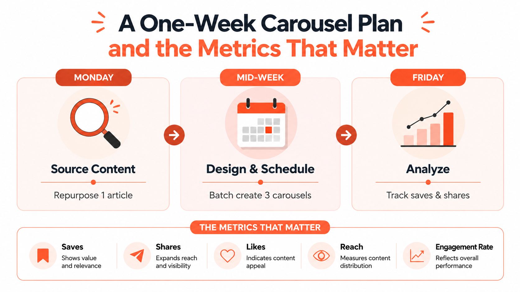
A solo creator or small team can run a workable carousel system in a week without turning it into a full production department. Monday is for source selection. Tuesday is for photo prep and file cleanup. Mid-week is for sequencing, template selection, and writing the hooks. Thursday is for building the set and exporting versions for each platform. Friday is for scheduling and review.
Keep the calendar tight and the metrics narrow
The metrics that matter most are the ones that show whether people moved through the post. Swipe-through rate tells you whether the sequence held attention. Saves per impression tells you whether the content felt useful enough to keep. Outbound clicks matter when the last slide includes a clear CTA.
Reach and likes can be noisy. They're worth checking, but they're not the strongest signal for whether a carousel did its job. A post that gets broad reach and weak completion isn't winning the distribution game. A post that gets fewer impressions but better saves and a cleaner click pattern often gives a more honest read on performance.
A simple pre-publish checklist keeps the process from slipping:
- Source is chosen: one article, transcript, or shoot set is committed.
- Slides are sequenced: the cover, middle, and payoff all support the same promise.
- Exports match the platform: size, format, and item count are checked.
- Text is readable: no slide depends on tiny copy to make sense.
- CTA is real: the final slide gives the reader a next step worth taking.
After 48 hours, check the three metrics again and decide whether the issue was the hook, the pacing, or the offer. That's the difference between posting carousels and building a carousel system.
If you want a faster way to turn one article, transcript, or idea dump into a set of swipeable posts, WaveGen.ai can generate branded carousels, captions, and hashtags from the source content you already have. It's built for the kind of repeatable carousel workflow that keeps teams publishing without rebuilding every slide by hand, and it's a practical fit if you want one pipeline from draft to distribution.
carousel for photos
instagram carousel
photo carousel design
carousel workflow
social media carousels
Turn this kind of writing into a week of social content.
Paste a blog post, newsletter, or rough draft — WaveGen turns it into publish-ready carousels, captions, and slideshows for every channel.
No credit card · First posts in 2min