September 28, 2026
22 min read
10 YouTube Thumbnail Best Practices for More Clicks
Apply these YouTube thumbnail best practices to improve clarity, mobile performance, branding, testing, and audience trust.

A thumbnail can be reduced to 120 × 90 pixels in YouTube's own API system, which means your carefully composed design may be judged after dramatic shrinkage. That's why a thumbnail isn't just a picture. It's a promise that must remain recognizable, readable, and relevant while viewers scan a crowded feed.
YouTube guidance also emphasizes checking click-through rate, or CTR, soon after publishing, particularly on Home and Suggested surfaces during the first 24 hours. Independent thumbnail analysis found that designs with a human face averaged 6.8% CTR, compared with 4.1% without a face, while extreme expressions showed an 88% relative difference from neutral expressions in that study. Short copy matters too. Thumbnails using 1 to 5 words outperformed those using 11 or more words by a 75% relative difference. See the thumbnail CTR patterns study for the full context.
The following workflow treats YouTube thumbnail best practices as a complete performance system. You'll establish hierarchy, choose color and typography, use faces and negative space deliberately, protect brand recognition, adapt designs for other platforms, test responsibly, and turn proven patterns into reusable templates. WaveGen.ai can help maintain brand kits and adapt source content into on-brand social assets, but the thumbnail's promise still has to match the actual video. For adjacent visual workflows, explore AI fashion photography.
Table of Contents
- 1. Use High-Contrast Color Schemes for Visual Hierarchy
- 2. Make Typography Bold and Readable
- 3. Use Faces and Expressions With Intent
- 4. Build Consistent Branding for Series Recognition
- 5. Protect Negative Space and Clarity
- 6. Test Variations and Read the Data
- 7. Use Trends Without Sacrificing Relevance
- 8. Align Color With the Viewer's Emotional Need
- 9. Create Ethical Curiosity Instead of Clickbait
- 10. Optimize for Mobile and Cross-Platform Responsiveness
- 11. Finish With Technical Specs, Safe Zones, and Templates
- 11-Point YouTube Thumbnail Best Practices Comparison
- Turn Every Thumbnail Into a Tested System
1. Use High-Contrast Color Schemes for Visual Hierarchy
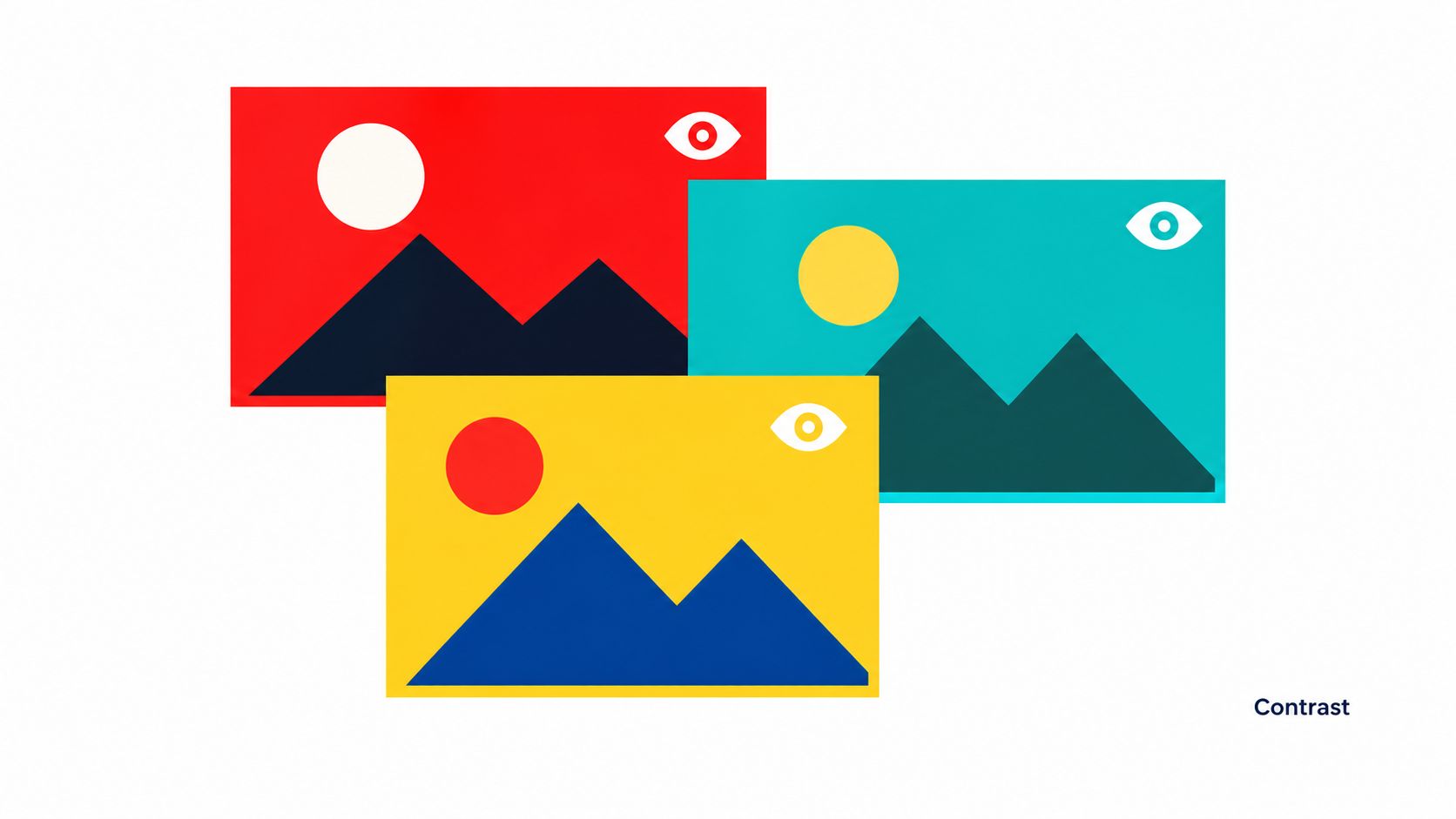
Color should tell viewers where to look first. A strong thumbnail usually has one dominant subject, a background that separates it clearly, and a restrained accent that signals the main hook. Bright, saturated backgrounds have outperformed muted or dark backgrounds by 8% to 14% CTR in a separate 2026 study, although that result should be treated as a testing direction rather than a universal rule. The relevant YouTube thumbnail research summary provides the broader pattern.
Creators such as MrBeast use recognizable red and yellow combinations, while Veritasium often pairs bold blue and orange. Ali Abdaal demonstrates the opposite route, using minimalist compositions where contrast comes from clean separation and controlled color rather than visual noise.
Build a palette that survives reduction
Start with the subject, not the color wheel. Place the face, product, or key object against a background with a different value and saturation. Then check the design against both light and dark YouTube feed environments.
A simple working process:
- Choose one dominant background: Let it support the subject instead of competing with it.
- Add one secondary color: Use it for a panel, border, or supporting shape.
- Reserve an accent: Apply it to the hook word, arrow, highlight, or key detail.
- Inspect the reduced version: Shrink the thumbnail until the focal point and promise still read instantly.
A brand kit can preserve approved colors across YouTube thumbnails, quote cards, carousels, and short-form graphics. WaveGen's brand controls are useful here, but don't let palette consistency override clarity. A branded thumbnail that blends into the feed is less useful than a slightly unconventional one that makes the video recognizable.
2. Make Typography Bold and Readable
Thumbnail text should reinforce the promise, not explain the video. In the independent analysis cited earlier, 1 to 5 words beat 11 or more words by a 75% relative difference, which supports a practical rule: use a short hook that adds context the title doesn't already provide. The thumbnail CTR patterns research connects short text with faster visual processing.
Use a bold sans-serif typeface with simple letterforms. Marques Brownlee's clean text treatments work because viewers can identify the message without decoding decorative typography. GaryVee frequently uses short, energetic phrases, while Wired's interview thumbnails rely on a consistent title treatment that helps viewers recognize the series.
Give every word a job
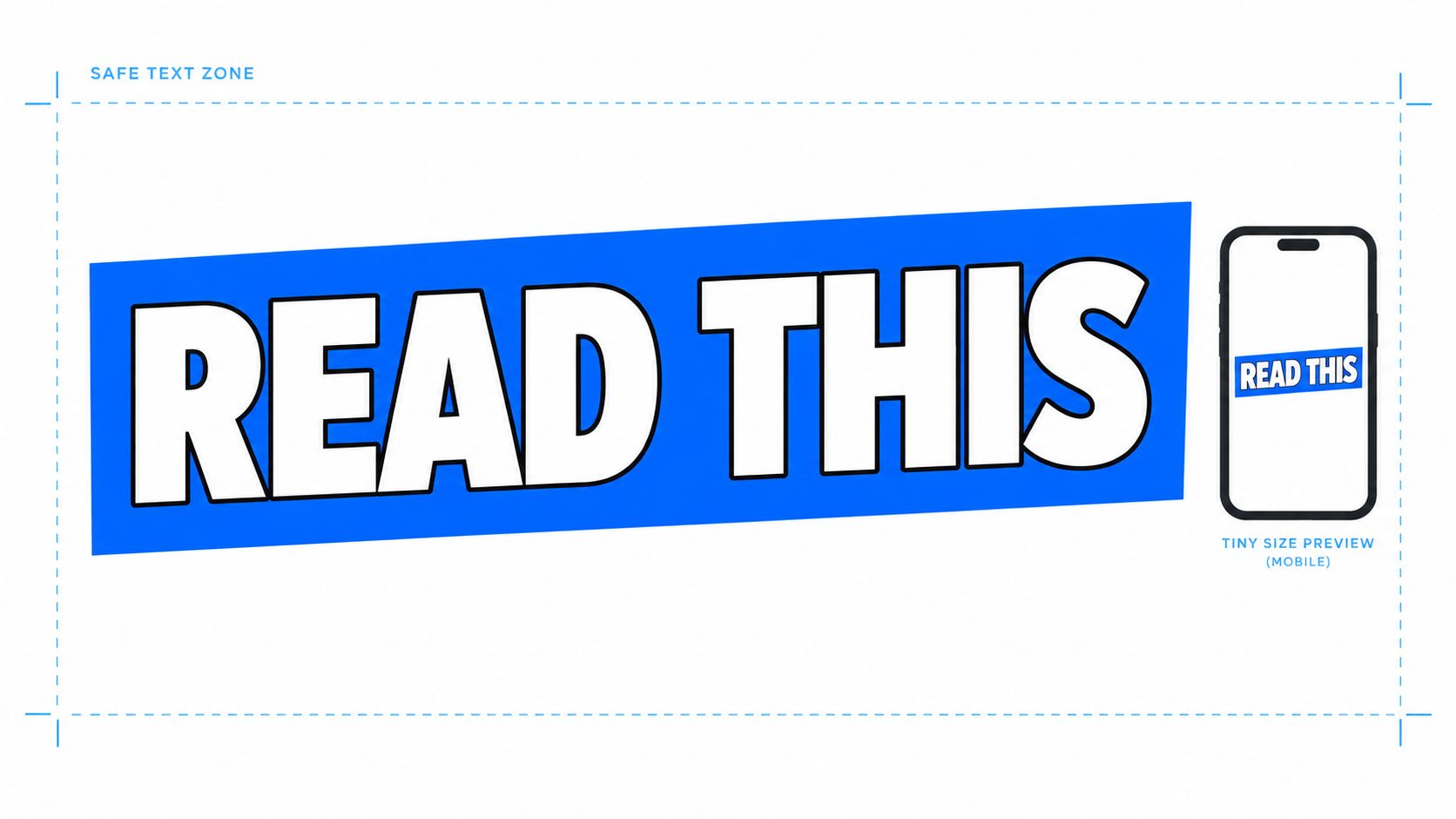
A thumbnail phrase such as “READ THIS”, “THE COST”, or “WORTH IT?” can work when it creates tension with the title. A sentence that repeats the title usually wastes valuable space. If the video title already says “How to Build a Better Morning Routine,” the thumbnail might emphasize “STOP THIS” or show the resulting routine instead of restating the subject.
Use contrast around the letters, but don't turn every word into a sticker. A subtle outline, shadow, or solid text panel can protect legibility when the background contains detail. Test the phrase at the smallest realistic display size and inspect it while moving quickly through a grid of other thumbnails.
Practical rule: If you need to pause and read the thumbnail, the viewer probably will, too.
Keep text away from areas where interface elements or crops may interfere. Place the hook beside the focal point when possible, and leave enough breathing room for the design to remain legible after resizing for social previews. WaveGen's editor can help you preview text across adapted assets, but human inspection remains essential.
3. Use Faces and Expressions With Intent
Faces can create an immediate emotional entry point, but adding a face automatically won't improve every thumbnail. The independent study of 1,000 thumbnails reported 6.8% average CTR for thumbnails with a human face, compared with 4.1% without one, and found an 88% relative difference between extreme and neutral expressions. Those findings make faces worth testing, not mandatory.
A close-up reaction works best when it answers a visual question. A surprised creator beside a failed product, an excited expression next to a dramatic result, or a doubtful face beside a controversial claim gives the emotion a cause. A floating face with no connection to the video may attract attention but create a weak promise.
Match emotional intensity to the subject
Entertainment and challenge videos may benefit from visibly heightened expressions. Educational, finance, legal, and B2B content often needs a more credible signal, such as concentration, concern, confidence, or a clear interaction with the subject. Excessive shock can make a serious topic look sensational and may reduce trust even if it earns an initial click.
Choose a frame with clear eyes, readable posture, and lighting that separates the face from the background. Crop tightly enough to show the expression, but keep the surrounding object or context if it explains what the person is reacting to.
- Use authentic reactions: Select a real moment from the video when possible.
- Show the trigger: Pair the face with the result, object, or scene causing the emotion.
- Avoid emotional duplication: Don't use a shocked face when the title already communicates shock.
- Compare face-led and object-led versions: Your audience may respond better to evidence than expression.
When repurposing a video for other channels, preserve the recognizable subject while adapting the crop. A face that works in a horizontal YouTube thumbnail may need a different placement in a vertical social asset.

4. Build Consistent Branding for Series Recognition
Brand recognition should work before a viewer reads the title. Repeated typography, color cues, subject placement, and visual rhythm help viewers connect separate videos, as seen in channels such as Vsauce, WhatIF, Kurzgesagt, and Ted-Ed.
A recognizable system needs variation. If every topic uses the same face, background, and text position, the channel can look predictable and the thumbnail may stop reflecting the video's specific promise. Keep a few stable signals, then adapt the composition to the subject, emotional angle, and platform.
Build a small layout library rather than one rigid template:
- Face-led layout: Place the creator or guest on one side and reserve the other for a concise hook.
- Object-led layout: Let a product, chart, location, or result carry the visual argument.
- Text-led layout: Use a short statement with one supporting image when the idea matters more than a person.
- Series marker: Add a consistent label, icon, or color cue for recurring formats without covering the main subject.
Review the family together in a channel grid. The thumbnails should feel related at a glance, while each one still offers a distinct visual promise. For social adaptations, preserve the strongest brand cue, then rebuild the crop and hierarchy for the new aspect ratio rather than shrinking the YouTube design.
Use a small logo only if it supports recognition. It rarely creates the click by itself, and an oversized mark competes with the content. A hero color can strengthen recall, but reserve it for meaningful brand moments so it stays distinctive.
WaveGen can store approved fonts, colors, logos, and voice settings when several people produce assets or one video becomes a week of social content. Treat these settings as guardrails. Templates should speed sound decisions, not preserve a weak composition.
5. Protect Negative Space and Clarity
A clear thumbnail makes its promise before the viewer reads every word. Start by identifying one focal point, then remove any face, text block, shape, or background detail that competes with it. YouTube recommends simple thumbnails that remain readable at small sizes and work visually with the title. The official YouTube thumbnail guidance also notes that designs can appear differently across devices.
Negative space gives the subject room to register. It may be an open area beside a face, around a product, or behind a short phrase. Its purpose is functional: preserve separation, support a crop, and make the emotional or informational direction clear.
Check the hierarchy before export
Run the design through three quick views: squint at it, reduce it substantially, and place it against a plain feed-like background. If the subject disappears or the message becomes vague, simplify before publishing.
Ask these questions during review:
- What do I see first? A texture or logo signals a weak focal point.
- What do I see second? The next element should add context, not create another story.
- Can I summarize the promise? Remove details until the answer is easy to state.
- Does the title complete the idea? The thumbnail and title should divide the work, rather than repeat the same words.
Use the rule of thirds as a starting point. Leave room for the title and interface, then adjust for the image's visual weight. A centered product can outperform a third-based arrangement when symmetry communicates comparison, precision, or authority. That outcome depends on the subject and audience, so retain the layout only if channel data supports it.
Keep faces, key words, and important objects away from the edges. Cropping changes across placements, especially when one concept is adapted for social channels. WaveGen's visual editor can preserve editable spacing for those variations, but every version still needs one obvious focal point and a readable promise.
6. Test Variations and Read the Data
A thumbnail earns more reliable decisions when every change starts with a hypothesis. YouTube thumbnail CTRs are commonly reported in the 2% to 10% range, with 2% or lower described as weak and 6% or higher as strong in a 2026 industry summary from Gyre's thumbnail CTR guidance. Treat those ranges as directional, since audience, traffic source, topic, and viewer intent change what a result means.
Short hooks usually survive reduction better. A three-word phrase can keep its letterforms intact at feed size, while a full sentence may collapse into a grey block. Test the thumbnail at the size viewers will encounter it, then compare results across similar videos rather than chasing an external benchmark.
Design the test before publishing
Change one major variable at a time. If Version A uses a face, red background, and three-word hook while Version B uses an object, blue background, and a different title relationship, the result cannot identify the cause. Isolate the focal point, expression, background contrast, text treatment, or relationship between title and image.
Write a compact test record:
- Hypothesis: State what should improve and why.
- Variable: Name the single design change.
- Context: Note the topic and likely traffic surfaces.
- Result: Compare CTR with viewer behavior and traffic source.
- Decision: Keep, modify, or reject the pattern.
Review results across comparable uploads. A finance audience may respond to a clear chart on one topic and a face-led warning on another. One result can reveal a useful question, but repeated evidence should shape the template. Save winning variants with editable layers so the same visual system can adapt to Shorts, social feeds, and other crops without losing its promise.
A thumbnail swap can diagnose weak packaging, especially when impressions remain healthy but clicks lag. It cannot repair a topic, title, or opening that fails to meet viewer expectations. Read the image, title, traffic source, and retention together, then improve the package rather than optimizing the thumbnail in isolation.
7. Use Trends Without Sacrificing Relevance
A trend earns space in a thumbnail only when it strengthens the video's promise. Memes, game launches, cultural moments, and familiar visual conventions can provide instant context, but they also fade quickly. They may confuse viewers outside the moment or make an evergreen video feel disposable.
Use the reference to explain why the topic matters now. A news channel might apply an urgent red treatment during breaking coverage. A gaming creator could feature an element from a newly popular game. A finance creator might use a recognizable market meme when the video directly explains that event. In each case, the trend should clarify the subject or outcome, not serve as decoration.
Keep the channel's durable identity intact. Preserve the logo, type system, and core composition, then let the trend affect one controlled element, such as the background, prop, icon, or phrasing. This preserves recognition while giving the package timely relevance.
Run a relevance check before designing
Ask:
- Does the video address the trend?
- Will viewers outside the trend understand the promise?
- Will the reference still make sense after the conversation fades?
Adapt a visual cue rather than copying a viral thumbnail. Familiarity can support recognition, while close imitation makes videos look interchangeable. Apply the cue to a specific audience problem or result so the design remains useful after the trend passes.
Track trend-led thumbnails separately from evergreen designs. A temporary curiosity spike may raise CTR without improving returning-viewer preference. Compare clicks with traffic source and subsequent viewing behavior before adding the treatment to a reusable template. Save successful versions with editable layers, so the same concept can be adapted for Shorts and social feeds without losing its original promise.
8. Align Color With the Viewer's Emotional Need
Color should reinforce the viewer's expected response, while the full composition carries the meaning. Red can signal urgency or energy, blue may feel calm or trustworthy, and yellow can attract attention. These associations vary by audience, culture, niche, and surrounding imagery, so treat them as design hypotheses rather than fixed rules. For broader brand guidance, see color psychology in branding.
Start with the viewer's likely need:
- “I need to understand this.” Use controlled contrast, clear subject separation, and a restrained accent.
- “I want to see the result.” Give the outcome a distinct color or brightness value so it reads quickly.
- “This feels urgent.” Use a vivid accent, warning shape, or decisive expression, then check that the treatment matches the topic.
- “I trust this explanation.” Keep the palette controlled and give evidence-led imagery enough space.
- “I can learn this calmly.” Reduce competing hues and let the main subject remain easy to inspect.
A finance tutorial and a comedy challenge may both use yellow, yet the color should serve different promises. The finance design might pair a muted background with a clear figure or chart. The challenge could support stronger saturation and movement. In both cases, color must help viewers identify the subject and expected payoff before they click.
Judge the palette as part of the complete thumbnail. Hue, brightness, facial expression, typography, title, and image subject work together. A color that feels trustworthy beside a chart may feel frantic beside a shocked face. Test the finished composition with the channel's audience, particularly for international viewers and professional niches where exaggerated color can reduce credibility.
WaveGen's brand kit can retain an approved emotional palette across thumbnails, Shorts, and social assets. Keep that consistency, but assign emphasis according to each video's topic. Save the selected colors as editable template tokens, then compare their performance with channel-specific testing rather than assuming a universal emotional response.
9. Create Ethical Curiosity Instead of Clickbait
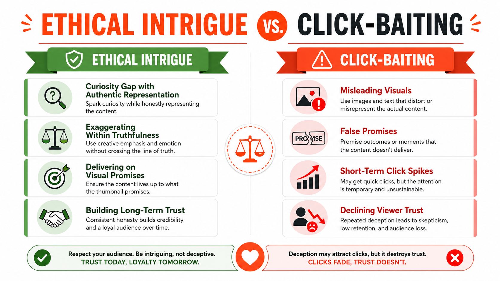
A thumbnail earns the click by withholding information, not by inventing a promise. Show a real tension, result, question, or contrast that the video resolves. Deceptive clickbait suggests drama, emotion, or an outcome the edit never delivers, weakening trust even when the initial click is strong.
Start with the moment that proves the promise. A before-and-after image works when the title explains the change. A question creates useful curiosity when the video answers it clearly. A reaction face needs a visible object or event that justifies the expression. If the design implies a failed experiment or financial risk, the edit must contain that failure or explain that risk rather than use fear as decoration.
Run a promise check before publishing
Find the exact scene, result, or evidence represented in the thumbnail. Then review the title and image together:
- Does the image represent the video's central value?
- Does the title add context rather than contradict the image?
- Would a viewer feel accurately informed after watching?
- Is the curiosity based on missing information, not a false claim?
Keep a record of the thumbnail concept, supporting timestamp, and final outcome. That small production step makes approval repeatable across a channel and helps editors adapt the same idea for Shorts or other social formats without changing its meaning.
Comments and retention patterns provide useful qualitative signals. Viewers may describe a misleading promise directly, while an immediate drop after the click can indicate that the opening fails to match the thumbnail. Test these signals alongside click-through data, since curiosity can attract attention without producing a satisfying viewing experience.
Apply the same standard to repurposed assets. A TikTok teaser or LinkedIn graphic should preserve the source video's conclusion and context. WaveGen can help adapt approved visuals, but the creator remains responsible for keeping every version truthful.
10. Optimize for Mobile and Cross-Platform Responsiveness
A thumbnail must work in more than one environment. YouTube may display it beside other videos, inside a search result, or within a recommendation surface. A social adaptation may use a different crop, aspect ratio, or surrounding interface. Designing only the desktop version creates avoidable failures.
YouTube's thumbnail system exposes a 120 × 90 pixel default video thumbnail size through its Data API, a useful reminder that recognition has to survive aggressive reduction. The YouTube Data API video resource documentation gives the technical context for that default image system. Your working design can be larger, but the core subject and hook should remain clear when reduced.
Design for the narrowest useful view
Preview the thumbnail at a small display size, then inspect every platform-specific crop. Text that works horizontally may become awkward in a vertical frame. A face near the edge may disappear, and a product may lose the context that made it meaningful.
Use WaveGen's social media image sizes guide when adapting assets, then confirm the final preview inside the destination workflow. Keep critical text, faces, and logos away from edges, and use solid contrast blocks instead of fine textures when the design must shrink.
The same thumbnail doesn't need to appear identically everywhere. Preserve the promise and focal point, then rebuild the crop for each context. A horizontal YouTube thumbnail might become a vertical short-form cover with the subject enlarged and the text repositioned.
11. Finish With Technical Specs, Safe Zones, and Templates
Creative decisions can fail during export. A cropped face, compressed text edge, incorrect aspect ratio, or misplaced logo can weaken an otherwise effective thumbnail. Treat the final preflight as part of design, not as an administrative step.
Confirm the canvas and destination requirements in the publishing tool before exporting. Keep essential content inside a safe zone, especially when one source asset will be adapted into several formats. Then inspect the exported file rather than assuming the source document represents the final result.
Build templates around the content type
A tutorial may reserve one area for the lesson outcome and another for the creator. A product review may give the product a fixed zone, with a short verdict and series marker. A podcast thumbnail may prioritize guest imagery, a concise hook, and a stable brand treatment.
Use a production checklist:
- Canvas and crop: Confirm the final dimensions and aspect ratio.
- Legibility: Read the text at reduced size and in the actual feed preview.
- Contrast: Check the focal point against both light and dark surroundings.
- Safe zones: Keep faces, logos, and essential words away from edges.
- Promise accuracy: Verify that the image reflects the actual video.
- Editable structure: Save separate layers or reusable elements for adaptations.
A practical template library starts with face-led, object-led, and text-led structures. Adapt the winning structure to the topic instead of forcing every video into one composition. WaveGen's AI content generator for YouTube can support thumbnail ideation and repurposing workflows, while YouTube Shorts dimensions can help when the source asset needs a vertical adaptation.
11-Point YouTube Thumbnail Best Practices Comparison
| Strategy | 🔄 Implementation Complexity | ⚡ Resource Requirements | ⭐ Expected Effectiveness/Quality | 📊 Ideal Use Cases | 💡 Key Tip |
|---|---|---|---|---|---|
| High-Contrast Color Schemes for Visual Hierarchy | Medium, requires palette selection and testing 🔄 | Low–Medium, design time, color tools, accessibility checks ⚡ | ⭐⭐⭐⭐, strong CTR lift (≈+30%) and visibility | Thumbnails needing immediate standout across feeds and repurposed social assets 📊 | 💡 Test at real thumbnail size (320x180) and apply 60-30-10 rule |
| Bold, Readable Typography and Text Sizing | Low, font + size rules to enforce 🔄 | Low, font assets, editor settings, minimal designer time ⚡ | ⭐⭐⭐⭐, clear message comprehension, consistent branding | Titles/CTAs where concise messaging must read on mobile 📊 | 💡 Limit text to 2–4 words, use 2–3px outline for legibility |
| Strategic Use of Faces and Emotional Expressions | Medium, requires consistent photography & direction 🔄 | Medium, photo sessions, lighting, retouching ⚡ | ⭐⭐⭐⭐⭐, highest engagement lift (≈35–40% CTR) | Personality-driven channels, vlogs, reactions, personal brands 📊 | 💡 Use close-ups (40–60% frame) with authentic expressions |
| Consistent Branding Elements and Series Recognition | Medium, initial design system setup 🔄 | Medium, brand kit, templates, asset library ⚡ | ⭐⭐⭐⭐, improves recognition and repeat clicks | Serialized content, channels wanting strong brand recall 📊 | 💡 Lock logo, colors, and templates in a brand kit and rotate templates |
| Strategic Visual Negative Space and Clarity | Medium, requires disciplined layout decisions 🔄 | Low, design restraint and templates ⚡ | ⭐⭐⭐⭐, faster cognition, cleaner professional look | Informational content, product shots, educational thumbnails 📊 | 💡 Use rule of thirds, leave 15–20% border, limit focal points to 2–3 |
| A/B Testing and Data-Driven Optimization | High, systematic tests and documentation 🔄 | Medium–High, analytics, time, tracking tools ⚡ | ⭐⭐⭐⭐, incremental, compounding CTR gains over time | Channels aiming for continuous improvement and audience-specific wins 📊 | 💡 Test one element at a time and collect 50–100+ impressions before judging |
| Trend Awareness and Timely Visual References | Medium, ongoing monitoring and quick adaptation 🔄 | Low–Medium, trend tracking, rapid mockups ⚡ | ⭐⭐⭐, boosts short-term relevance but can date quickly | Time-sensitive content, topical videos, growth-focused campaigns 📊 | 💡 Reserve core brand elements, add trend accents expected to last 2–4 months |
| Color Psychology and Emotional Trigger Alignment | Medium, research + cultural considerations 🔄 | Low, color tools and testing, brand kit updates ⚡ | ⭐⭐⭐⭐, nudges emotion; red/yellow often ↑ CTR by 5–10% | Content where emotional framing improves conversion (urgency, trust) 📊 | 💡 Choose color by intended emotion and lock scheme in brand kit |
| Avoiding Click-Baiting While Maintaining Intrigue | Medium, restraint and editorial alignment 🔄 | Low, editorial review and consistency checks ⚡ | ⭐⭐⭐⭐, sustains trust and long-term watch-time quality | Educational, long-term growth channels, brands prioritizing retention 📊 | 💡 Ensure thumbnail promise matches content; ask “Would I click this?” |
| Mobile Optimization and Cross-Platform Responsiveness | Medium, requires multi-aspect previews and safe zones 🔄 | Medium, previews, multiple aspect templates, testing ⚡ | ⭐⭐⭐⭐, essential (70%+ mobile viewers) for readability and CTR | Any channel with large mobile audience or cross-platform repurposing 📊 | 💡 Design for narrowest viewport (120x68px), keep 10–15% safe margins |
| Technical Specs, Safe Zones, and Reusable Templates | Low–Medium, final preflight workflow step 🔄 | Low–Medium, template creation, export checks ⚡ | ⭐⭐⭐, prevents technical failures and speeds production | High-volume series, teams needing reproducible assets and handoffs 📊 | 💡 Maintain checklist (dimensions, safe zones, compression) and save templates |
Turn Every Thumbnail Into a Tested System
The best YouTube thumbnail best practices become useful when they form a repeatable production system. Start with the video's single viewer promise. Decide whether the strongest focal point is a face, object, result, question, or piece of evidence. Then build the composition around that decision instead of adding every attention-grabbing device at once.
Use a short, readable phrase only when it contributes something the title doesn't. Select contrast that separates the subject from the feed. Protect negative space and safe zones. Check the design at a reduced size, in light and dark surroundings, and in every platform crop you plan to publish. Ensure the image and title describe a promise the video delivers.
A reusable review can stay simple:
- Promise: Can one sentence describe what the viewer expects?
- Hierarchy: Is there one dominant focal point?
- Copy: Can viewers read the hook instantly?
- Contrast: Does the subject separate from the background?
- Composition: Does negative space support the message?
- Brand: Is the channel recognizable without overwhelming the topic?
- Adaptation: Does each platform version preserve the same promise?
- Truthfulness: Does the video support the image and title?
- Measurement: Have you recorded the relevant CTR and traffic context?
For your next upload, create two clearly differentiated variations rather than making several near-identical drafts. Write down the hypothesis before publishing. You might test a face against an object, a high-energy palette against a restrained one, or a short text hook against a purely visual treatment. Keep the change understandable so the result can inform your next design.
Use channel data as the final judge. External studies can identify promising patterns, but they can't tell you whether your audience trusts an exaggerated expression, prefers evidence-led visuals, or responds to a particular color system. Build a library of patterns that earn support across comparable videos, and retire designs that repeatedly create clicks without satisfaction.
WaveGen.ai can support the operational side by storing brand kits and adapting approved thumbnail concepts into platform-ready social assets. It shouldn't replace audience testing, editorial judgment, or the responsibility to make an accurate promise. The strongest workflow combines efficient production with careful observation and honest creative decisions.
WaveGen.ai helps turn YouTube source content into on-brand social assets, including adapted visuals, captions, carousels, short videos, and platform-specific formats. Set your brand kit once, review the variations in the visual editor, and visit WaveGen.ai to explore a workflow for distributing thumbnail-led content more consistently.
youtube thumbnail best practices
YouTube thumbnails
thumbnail design
YouTube CTR
content repurposing
Turn this kind of writing into a week of social content.
Paste a blog post, newsletter, or rough draft — WaveGen turns it into publish-ready carousels, captions, and slideshows for every channel.
No credit card · First posts in 2min