July 21, 2026
16 min read
Logo Usage Guidelines: WaveGen.ai's 2026 Standards
Master essential logo usage guidelines for WaveGen.ai. Cover clear space, sizing, colors, legal notes, and system integration. Stay compliant in 2026.
You open a shared folder to grab the logo for a new post. One file is a screenshot pulled from the website. Another has a transparent background but looks fuzzy when enlarged. A third version is slightly darker than the one used on LinkedIn last week. By the time the carousel, video thumbnail, and newsletter banner go live, your brand already looks like three different companies.
This highlights the significance of logo usage guidelines. They stop small visual mistakes from piling up into a brand problem. A stretched logo, the wrong color, or cramped placement doesn't just look untidy. It weakens recognition, makes collaborators guess, and turns every new asset into a fresh chance for inconsistency.
For teams producing content often, static brand PDFs rarely solve this on their own. The useful version of logo guidance is one that people can follow quickly, and ideally one that software can enforce. If your content gets repurposed into social posts, short videos, quote cards, and print handouts, your logo rules need to move from “nice document” to “working system.”
Table of Contents
- Introduction to Logo Usage Guidelines
- Understanding the Key Concepts
- Defining Key Aspects of Logo Usage Guidelines
- Selecting File Formats and Export Presets
- Adapting Logos Across Platforms
- Incorporating Legal and Attribution Requirements
- Integrating Guidelines with WaveGen.ai Brand Kit
- Conclusion and Downloadable Checklist
Introduction to Logo Usage Guidelines
A logo is your brand's handshake. People often meet it before they read your copy, visit your website, or talk to your team. That makes logo usage guidelines less like design trivia and more like operating instructions for one of your most visible assets.
When a logo gets used casually, the same mistakes show up everywhere. Someone drags a corner and stretches it. Someone places a dark logo over a dark photo. Someone exports a tiny JPG and reuses it in a presentation. None of those errors feel major in the moment. Together, they make the brand look less stable and less familiar.
Good logo usage guidelines answer practical questions before anyone has to guess. Which version goes on a dark background? How small can it appear? How much space should sit around it? Which files are approved? What should never happen to it under any circumstance?
A guideline is useful when a marketer, designer, freelancer, printer, or video editor can all reach the same result without asking for clarification.
That's why strong guidelines work as both shield and compass. They protect the mark from misuse, and they direct fast decisions across social media, print, video, sales decks, and partner materials. They don't reduce creativity. They remove avoidable variation, so creative work starts from a reliable visual base.
Understanding the Key Concepts
Before writing any rules, it helps to understand what those rules are trying to protect. A logo isn't just a file. It's a memory trigger. It's one of the fastest ways people connect a visual cue to a specific company.
Why consistency affects memory
Think of a logo like a short musical phrase in a film score. If the melody changes every time it appears, people stop connecting it to the same character. Logos work in a similar way. Repetition builds recognition only when the visual signal stays stable enough to be recognized as the same mark each time.
The average customer needs to see a logo 5 to 7 times before they remember the brand, according to the verified data provided for this article. That's why inconsistency creates friction. If the logo appears in different colors, proportions, or cluttered placements, some of those exposures don't reinforce the same memory as cleanly as they should.
Another useful framing is this. Your logo is not just artwork. It is a repeated identifier. Its job is to become familiar under many conditions without losing its shape, color logic, or legibility.
Why guidelines are business tools
Many teams still treat logo rules like a design appendix. That overlooks its critical importance. Verified data for this article states that consistent logo usage across all platforms directly correlates with a 23% increase in revenue, and that 75% of consumers recognize a brand exclusively through its logo. The same verified data also notes that 60% of consumers actively avoid brands with outdated or unappealing logos, and that 80% of people identify color as a key factor in recognition.
Those figures change the conversation. Guidelines aren't there because designers like neatness. They protect recognition and support commercial outcomes.
A simple mental model helps:
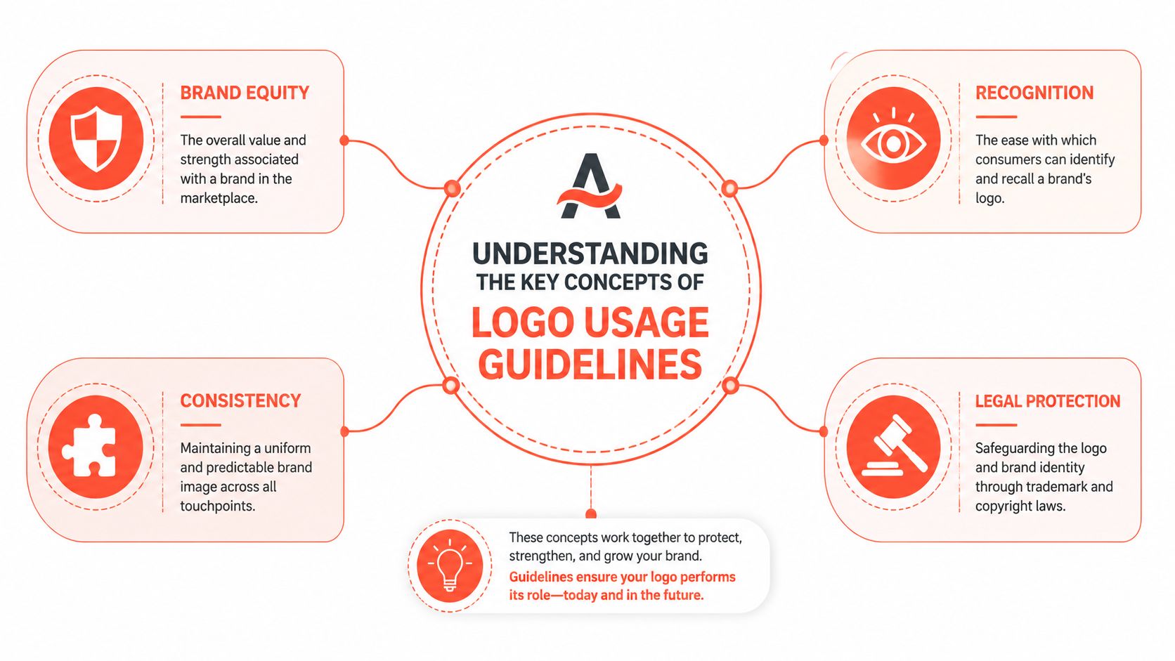
- Brand equity is the value attached to the brand over time.
- Recognition is how quickly people identify the brand from visual cues.
- Consistency is the discipline that makes recognition possible.
- Legal protection helps ensure others don't misuse or dilute the identity.
Practical rule: If a logo rule doesn't help recognition, legibility, or protection, it probably doesn't belong in the guide.
When teams understand those four ideas, technical rules stop feeling arbitrary. Clear space is no longer “extra empty room.” It becomes a way to keep the mark visible. Approved color variations stop being cosmetic choices and become memory safeguards.
Defining Key Aspects of Logo Usage Guidelines
A logo guide works best when it reads less like a poster on the wall and more like a set of production controls. In an automated repurposing system, that difference matters. If WaveGen.ai is turning one webinar into clips, carousels, blog graphics, and email headers, the logo rules need to be specific enough for a person to apply and clear enough for a platform to enforce.
The five rules every team needs
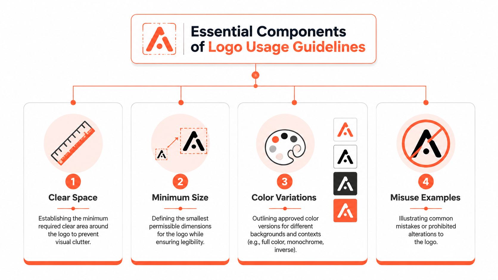
Start with clear space. A logo works like a signature on a check. If other marks press too close, it becomes harder to read and easier to ignore. Set the minimum space using a measurable part of the logo, such as the symbol height or the cap height of a key letter, so a designer, freelancer, or template engine can all follow the same rule.
Next is minimum size. This rule answers a simple question: at what point does the logo stop being legible? In a modern content workflow, that threshold should be defined for the assets your team produces every week, such as short-form video covers, mobile social posts, thumbnail images, and embedded website graphics. Then map those limits into reusable templates and approval rules inside your brand asset management system, so the wrong version does not keep resurfacing.
The third area is approved color variations. A practical set usually includes a full-color version, a one-color version, and a reversed version for dark surfaces. Without that control, teams start making small substitutions that seem harmless in isolation, then add up to a logo that looks slightly different in every channel.
Background control comes next. Visibility is not the same as clarity. A logo can sit on a photograph and still lose its edges, contrast, or shape memory. Good guidelines define when the mark can sit directly on an image, when it needs a solid panel, and when the background is too busy to use at all.
Then document prohibited misuse with examples, not vague warnings. Show the errors plainly so the rule is easy to spot during production and easy to translate into automated checks.
- Do not stretch or compress the logo.
- Do not recolor it outside approved versions.
- Do not rotate it.
- Do not add shadows, glows, outlines, or unofficial gradients.
- Do not place it on cluttered imagery where the edges disappear.
- Do not crop it into shapes or containers that are not approved.
These rules protect repetition. A brand becomes familiar because the same visual signal keeps showing up in the same recognizable form.
For teams refining broader identity systems, resources on effective branding solutions can help connect logo rules to the rest of the brand architecture, including messaging and visual hierarchy.
How to write rules people will follow
Usable logo guidelines answer production questions. What version goes on a dark reel cover? How small can the logo appear in a LinkedIn carousel footer? Which placement should a video template use so platform interface elements do not cover the mark?
A simple table format helps because it converts brand judgment into repeatable instructions.
| Rule | Good instruction |
|---|---|
| Spacing | Leave clear space equal to the symbol height on all sides |
| Size | Switch to the icon-only version when the full logo becomes hard to read |
| Color | Use the inverse logo on dark backgrounds only |
| Placement | Keep the logo away from corners where platform UI may overlap it |
| Misuse | Never crop, skew, or place the logo inside unapproved shapes |
A side-by-side example teaches faster than a paragraph. Show the correct use, the incorrect use, and the reason the incorrect version fails.
That approach is especially useful in automated content systems. If a rule can be written as a measurable setting, it can become part of the brand kit instead of living as a PDF nobody opens. Clear space becomes a placement boundary. Approved colors become locked variants. Background restrictions become template choices. That is how logo guidelines stop being passive documentation and start working like quality control.
Selecting File Formats and Export Presets
A logo file works like a mold in manufacturing. If the mold is clean, every copy comes out clean. If someone starts from a flattened screenshot or a low-resolution JPG, every new export carries that damage forward.
File rules matter most at the handoff stage. A social manager needs a transparent logo for a Reel cover. A web editor needs a file that stays sharp on a retina screen. A print vendor needs vector artwork that can scale to a banner without turning soft. If your guideline only says “use the approved logo,” people still have to guess which file to choose.
For digital systems, SVG is usually the master file for screen use because it scales cleanly. PNG is the everyday fallback when a platform or template needs transparency but does not support SVG well. JPG has a narrower role. It fits simple placements on solid backgrounds where transparency is irrelevant and a lightweight raster file is acceptable. For print and vendor handoff, PDF, EPS, or native design files preserve vector information more reliably.
If you're building or refining original logo artwork, Dirt Cheap Product's Illustrator workflow is a useful reference for understanding how vector-based creation supports cleaner exports later.
The key improvement for an automated publishing system is to turn those choices into defaults. Instead of telling a team to “remember the right format,” set the brand kit so the website export pulls SVG, social templates pull preset PNG sizes, and print requests surface PDF or EPS by default. Static guidance explains the rule. Automation applies it every time.
That only works if file storage and naming are disciplined. A folder full of “final-logo-new2.png” invites mistakes. A clearer setup is one approved source, a small set of locked derivatives, and a documented request path inside your brand asset management process. In WaveGen.ai, those rules can live inside the brand kit as executable settings rather than a reference document someone may never open.
A simple export decision table
Logo File Formats Comparison
| Format | Best Use | Pros | Cons |
|---|---|---|---|
| SVG | Websites, responsive digital assets, UI, scalable social graphics | Stays sharp at any size, lightweight, editable as vector | Not ideal for every legacy workflow |
| PNG | Social posts, decks, transparent overlays | Supports transparency, easy to place | Can blur if exported too small |
| JPG | Simple web placements on solid backgrounds | Small and widely supported | No transparency, compression can soften edges |
| Documents, print sharing, vendor handoff | Good for embedding and sharing vector content | Less convenient for quick social use | |
| EPS | Professional print production | Strong for printers and signage workflows | Not friendly for casual everyday use |
| AI | Master design editing | Best for source editing and control | Requires design software |
Export presets should match the destination, not the designer's preference.
A useful rule is to define one master file and a limited set of approved exports for real production needs. For example, your system might store an AI or EPS source file, generate SVG for web modules, provide PNG presets for social overlays in approved dimensions, and reserve PDF for printer handoff. That setup reduces improvisation.
The result is simple. People stop hunting for files, and the system stops publishing avoidable logo errors.
Adapting Logos Across Platforms
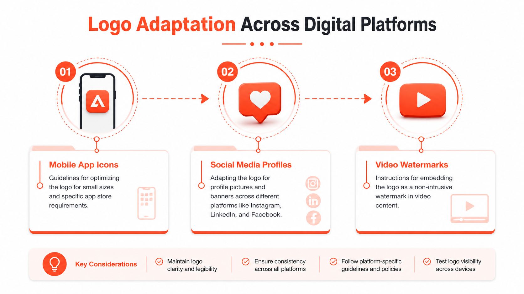
A logo that works on a website header can fail badly inside a circular profile image or a video watermark. Platform adaptation isn't about changing the brand. It's about choosing the right approved variation for the available space and context.
How the same logo changes by channel
Instagram profile images often crop into a circle, so a full horizontal logo may feel cramped or unreadable. An icon-only or lettermark version usually performs better there. LinkedIn banners create a different problem. The canvas is wide, but profile overlays and responsive cropping can obscure the corner where teams often place the logo.
TikTok and short-form video overlays add motion and compression. A delicate mark with thin details can disappear when placed over footage. In those cases, the best option is often a simplified variation on a quiet corner panel rather than dropping the full-color logo straight onto moving imagery.
Print asks a different question. A logo on business cards, workshop handouts, or packaging has physical constraints. Paper stock, background color, and small reproduction can all affect how clearly the mark appears.
If you need current platform dimensions before building templates, this reference on social media image sizes is useful for checking how each channel frames assets.
A practical adaptation workflow
Use this sequence when adapting a logo for any channel:
Check the crop first
Don't start with the logo. Start with the frame shape. Square, circle, vertical video, and header banners all treat margins differently.Choose the right variation
If the primary logo feels cramped, switch to the approved simplified version. Don't scale down the full logo until it becomes unreadable.Test contrast against the intended background A logo can look fine on a blank canvas and fail against actual footage or photography.
Account for platform interface elements
Buttons, captions, avatars, and progress bars can overlap the area you thought was safe.Preview on mobile
Many logo errors only show up at phone size.
The right logo variation is the one that stays recognizable in context, not the one that looks most complete in a mockup.
That mindset keeps teams from forcing one version into every placement. Consistency doesn't mean sameness at all costs. It means disciplined adaptation using approved options.
Incorporating Legal and Attribution Requirements
A logo guide should also answer legal questions before they become expensive questions. Design teams often focus on spacing and color, but legal details matter whenever logos appear in public, in partnerships, or in licensed materials.
What legal notes belong in the guide
Start with ownership. State who owns the logo and which version is the official protected mark. If the brand uses a trademark symbol, explain when to use ™ and when to use ®. Placement should be shown visually, especially for small applications where people tend to omit it.
Then cover attribution. If your logo appears in press kits, affiliate materials, sponsorship graphics, or co-branded campaigns, the guide should include the exact attribution language your organization requires. This avoids ad hoc wording from partners who mean well but guess wrong.
Co-branding deserves its own mini-rule set. Define relative sizing, alignment, spacing between logos, and which mark appears first in different situations. If a partner logo has its own requirements, document how the two systems interact rather than leaving staff to negotiate layout case by case.
For businesses formalizing ownership, this guide to trademarking a logo gives a useful overview of the legal process and the kinds of protection organizations typically consider.
Common compliance mistakes
Legal mistakes are often simple production mistakes wearing a legal costume.
- Missing symbol use can happen when someone exports a tiny version and removes the mark to “clean it up.”
- Unauthorized partner use happens when a sponsor, vendor, or affiliate downloads the logo from a website instead of receiving approved files.
- Unclear licensing terms create trouble when outside designers or resellers don't know what uses are allowed.
- Improvised attribution shows up in events, PDFs, and media kits when nobody supplies standard wording.
A practical guide should include one short legal checklist near the logo assets:
| Item | What to define |
|---|---|
| Trademark symbol | Whether it appears, and where |
| Attribution line | Exact approved wording |
| Partner use | What third parties may and may not do |
| Co-branding | Relative sizing and spacing rules |
| Approval path | Who signs off on exceptions |
That small addition saves a lot of email and reduces preventable misuse by people outside the core team.
Integrating Guidelines with WaveGen.ai Brand Kit
Static logo guidance usually fails in the handoff. The PDF says one thing, but the template library, editor defaults, and export settings allow something else. The fix is to turn rules into software settings wherever possible.
Turning rules into settings
A brand kit works best when it stores approved logo files by variation, assigns intended use, and limits accidental substitutions. Instead of uploading one generic logo file, upload the primary mark, icon-only version, inverse version, and one-color version as distinct assets with clear labels.
Then translate visual rules into operational constraints. If the logo needs consistent clear space, set template padding so people don't drag text too close. If only certain color versions are approved, pair each variation with the background conditions where it may appear. If the icon should be used below a certain size, map that choice to specific asset types such as profile images or watermarks.
Teams building this kind of system can use a practical walkthrough on how to create a brand kit to think through logos, colors, fonts, and reusable defaults together rather than as separate decisions.
What to lock and what to leave flexible
Not every setting should be editable.
Lock the rules that protect recognition:
- Approved logo files
- Protected spacing within templates
- Background-safe color variants
- Default placement zones
Leave flexibility where context changes:
- Which approved variation fits the format
- Relative scale within a safe range
- Whether the logo appears at all on text-heavy assets
- How the mark pairs with campaign imagery
A good brand kit doesn't eliminate judgment. It eliminates repeated avoidable mistakes.
That's the shift from documentation to enforcement. When guidelines live inside the production system, teams don't need to remember every rule from scratch. The system carries part of the discipline for them.
Conclusion and Downloadable Checklist
Strong logo usage guidelines make brand consistency easier, faster, and less dependent on memory. They help teams avoid fuzzy files, wrong colors, crowded placements, and improvised partner usage. Ultimately, they keep each appearance of the logo working toward the same outcome: recognition.
The payoff is practical. Fewer revisions. Cleaner handoffs. Less debate in reviews. Better continuity across social posts, decks, printed materials, and videos. For teams producing content frequently, those small operational wins add up.
If you're building your own guide, use this checklist as a starting point:
- Logo versions approved for primary, inverse, one-color, and icon-only use
- Clear space rule defined from a part of the logo itself
- Minimum size rule for digital and print applications
- Background rules for light, dark, and busy imagery
- Misuse examples showing what must never happen
- File format rules for source, digital, and print delivery
- Platform adaptations for profile images, video marks, and documents
- Legal notes covering symbols, attribution, and partner use
- System settings that embed these choices in templates and brand tools
Treat that checklist as a working document, not a one-time exercise. The best logo usage guidelines stay current, especially when your content output expands across more formats and more people touch the brand.
If you're turning one article, newsletter, podcast script, or transcript into a stream of social assets, WaveGen.ai helps you keep logos, colors, fonts, and voice consistent inside the workflow instead of relying on scattered files and memory.
logo usage guidelines
brand consistency
logo formats
clear space
brand kit
Turn this kind of writing into a week of social content.
Paste a blog post, newsletter, or rough draft — WaveGen turns it into publish-ready carousels, captions, and slideshows for every channel.
No credit card · First posts in 2min