June 11, 2026
14 min read
How to Create Brand Guidelines: A 2026 Playbook
Learn how to create brand guidelines teams will use. Our 2026 playbook covers visuals, voice, governance, & AI content application.
You probably have some version of this problem already.
Your logo exists in six folders. Sales is using an old deck. A freelancer picked a close-enough blue. Social posts sound playful on Instagram, stiff on LinkedIn, and generic everywhere else. Someone asks for the brand guidelines, and what you really have is a PDF from a past redesign plus a handful of “approved” files in Slack.
That's why learning how to create brand guidelines matters. Not because a brand document looks polished, but because marketing moves fast, content gets repurposed constantly, and more teams now create brand assets without a designer in the loop. Good guidelines reduce guesswork. Great guidelines become a working system people use.
Table of Contents
- Start with Strategy Not with Swatches
- Define Your Core Visual Identity
- Craft Your Brand Voice and Imagery Style
- Assemble the Brand Guideline Document
- Implement Rollout and Governance Procedures
- Apply Guidelines to AI and Repurposed Content
Start with Strategy Not with Swatches
Most weak brand guidelines fail before the design work starts. The team jumps into logo refinements, color boards, and font choices without agreeing on what the brand is trying to say, who it's trying to reach, and what kind of impression it should leave.
That approach creates a document full of assets and very little direction. The visuals may look clean, but they won't hold up when different teams start applying them to web pages, sales decks, ads, packaging, social posts, and partner materials.
According to Bynder's explanation of brand-guideline workflow, a practical process starts with mission, vision, values, audience, voice, and market, then moves into the logo system, color values, typography hierarchy, and imagery rules before being packaged into usage guidance across touchpoints.
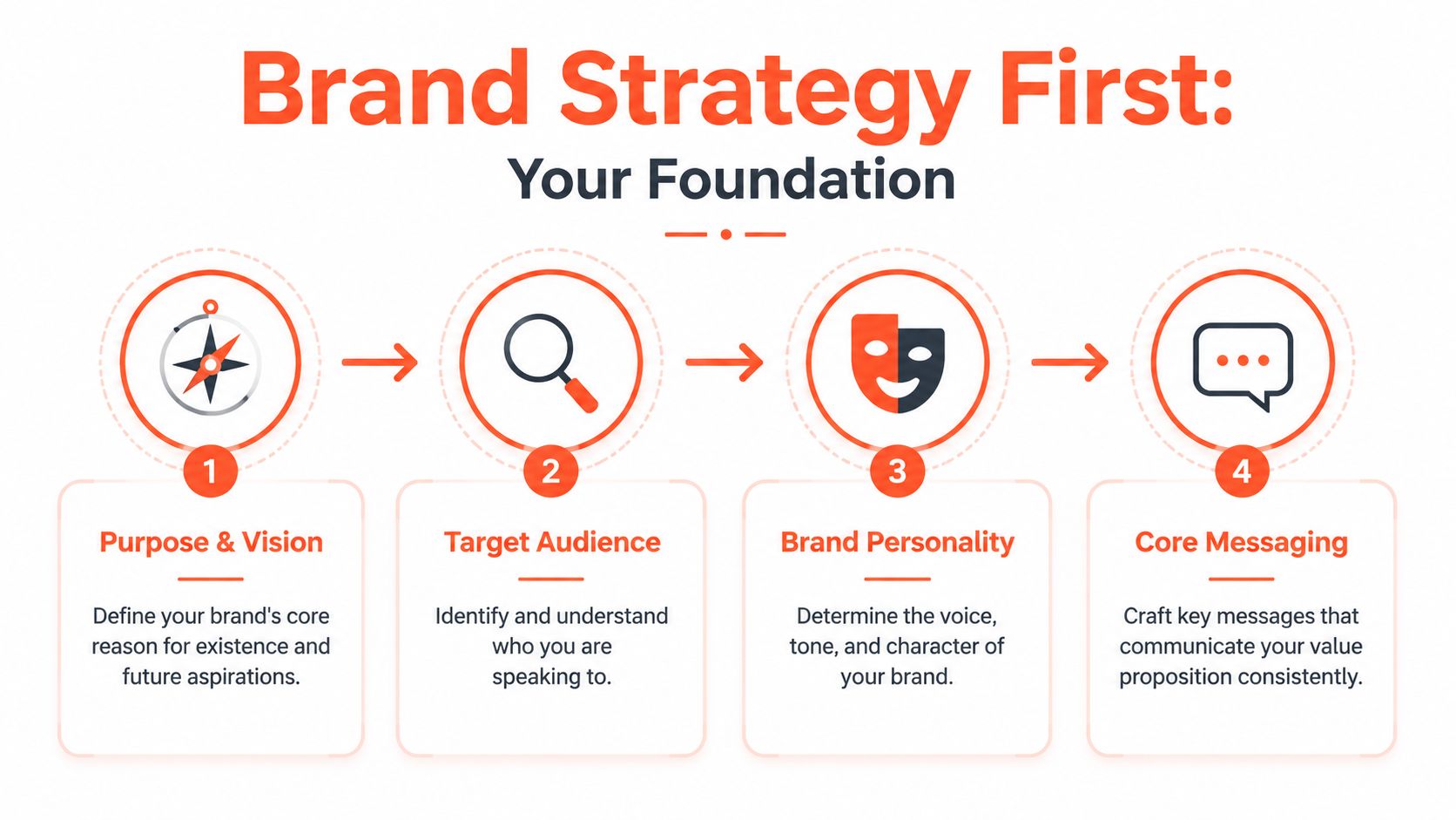
Get alignment before design
Start with six decisions.
- Mission: What do you do for customers right now?
- Vision: What future are you trying to create?
- Values: What principles shape how you act?
- Audience: Who are you for, in practical terms?
- Voice: How should the brand sound when it speaks?
- Market position: What space do you want to own?
If these answers are fuzzy, your visual system will drift because every future choice will be subjective. One designer will interpret “premium” as minimal. Another will interpret it as formal. A copywriter may hear “approachable” and produce casual social captions that undercut a high-trust service.
Practical rule: If two smart people on your team would answer “Who are we for?” differently, you're not ready to finalize the visual identity.
Useful strategy statements are short and specific. “We help growing B2B teams simplify reporting” is usable. “We facilitate synergistic solutions” is not. The first can guide copy, landing pages, and design decisions. The second can't guide anything.
Define the audience in usable terms
A demographic profile isn't enough. “Women aged 30 to 45” or “SMB founders” doesn't tell your team how to speak, what pain points to emphasize, or what level of sophistication the design should carry.
Write audience guidance in behavioral language:
- What they're trying to achieve
- What frustrates them
- What they already know
- What they're skeptical of
- What kind of language they trust
That level of detail shapes real execution. A founder audience usually tolerates speed and directness. A regulated-services audience often needs more precision, more reassurance, and fewer clever slogans.
Brand personality has to drive execution
Brand personality is where strategy starts affecting creative work. Pick a small set of traits that can survive across channels. For example: clear, assured, practical. Or energetic, optimistic, and plainspoken.
Then pressure-test those traits. If your brand is “expert but approachable,” what does that mean in an email nurture sequence? In a webinar slide? In a customer-support reply? If you can't translate the trait into behavior, it's still a slogan, not a guideline.
Define Your Core Visual Identity
Visual identity becomes easier once the strategic decisions are solid. You're no longer choosing what looks nice. You're choosing what expresses the brand clearly and repeatedly under real-world constraints.
The three pillars are logo system, color system, and typography system. Most first-time guidelines under-document all three. They show the preferred version but skip the edge cases, which is exactly where inconsistency starts.
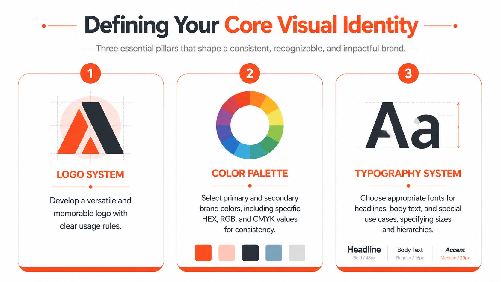
Build a logo system not just a logo
A logo by itself isn't a system. You need approved versions, context rules, and misuse examples.
Your logo section should include:
- Primary logo: The default version for most applications.
- Secondary logo: An alternate lockup for constrained layouts.
- Icon or mark: A simplified option for avatars, favicons, or small placements.
- Reversed versions: Approved options for dark backgrounds.
- Clear space: The minimum breathing room around the logo.
- Minimum size: The point where the mark stops being legible.
- Don'ts: Stretching, recoloring, rotating, adding effects, or placing it on poor backgrounds.
The key is precision. Canva's visual style guide advice notes that teams should define brand colors with exact hex, CMYK, and sometimes Pantone values, specify typography by typeface, size, spacing, weight, and web styles, and define logo proportions and alignment “down to the pixel” to reduce interpretation in production work, as explained in Canva's brand style guide article.
Here's a useful walkthrough before you document your own specs:
The most common logo problem isn't dramatic misuse. It's minor inconsistency repeated hundreds of times.
Specify color for every environment
Color breaks quickly when teams move across channels. A shade that looks right on a website may print poorly, shift on merchandise, or vary across vendor files if you haven't documented it properly.
Document each core color in the formats your team uses:
- HEX for web and digital interfaces
- RGB for screen-based work
- CMYK for print production
- Pantone when physical reproduction requires tighter consistency
Don't stop at listing swatches. Add usage rules. Which is the primary brand color? Which colors are reserved for calls to action, data visualization, backgrounds, or accent moments? Which combinations should never appear together?
That prevents a common problem in growing teams. Everyone uses the official palette, but nobody uses it the same way.
Turn fonts into a typography system
Typography guidelines should answer more than “what font do we use?” They should define hierarchy.
Create a simple system around:
- Primary typeface for headings or key brand moments
- Secondary typeface for body copy and long-form readability
- Optional accent face if you need one for campaigns or editorial expression
Then document the operating rules:
- Headline sizes and weights
- Subhead hierarchy
- Body size and line spacing
- Caption or metadata style
- Web fallback options
- Rules for emphasis such as bold, italic, and all caps
If your team uses Google Slides, Canva, Figma, Adobe Express, and web CMS tools, test the type system across all of them. A beautiful typography choice that only works in one environment creates friction fast. In practice, a slightly less distinctive font system that works everywhere often outperforms a more fashionable one that breaks in half your stack.
Craft Your Brand Voice and Imagery Style
A financial advisor once described her brand as “warm, modern, and trusted.” Her website copy sounded polished. Her Instagram captions sounded like a lifestyle influencer. Her webinar slides read like legal disclaimers. None of it was wrong in isolation. Together, it felt like three different businesses.
That's what happens when voice is implied instead of defined.
Voice stays consistent and tone adapts
Brand voice is the enduring personality. Tone changes with context.
A clear voice guideline might say the brand is:
- confident, not arrogant
- helpful, not overexplaining
- plainspoken, not casual-for-the-sake-of-it
Then tone can shift by situation. A launch post can sound energetic. A billing email should sound calm and direct. A customer-support article should be clear and steady.
A useful voice guide gives writers boundaries they can apply under pressure, not adjectives they have to interpret from scratch.
The easiest way to write this section is with contrast. Show what the brand sounds like, and what it doesn't.
For example:
- “We help teams publish faster without losing quality” feels direct.
- “We facilitate uninterrupted content velocity for modern brands” feels inflated.
A good voice guide also covers vocabulary choices. List phrases you prefer, phrases you avoid, how technical your language should be, whether contractions are normal, and when industry jargon is acceptable.
Imagery needs rules not taste
Imagery drift is usually worse than logo drift because more people touch it. Designers, social managers, freelancers, video editors, and founders all make image choices. If the rule is “make it feel premium,” they'll all interpret that differently.
Write imagery guidance around visible characteristics:
- Photography style: candid or posed, natural light or studio, close-up or environmental
- Subject matter: customers in action, product detail, team moments, abstract textures
- Color treatment: bright and crisp, muted and editorial, high contrast, black and white
- Composition: clean negative space, off-center framing, dense scenes, simple backgrounds
- Illustration style: flat, dimensional, hand-drawn, geometric, editorial
- What to avoid: cliché stock poses, over-filtered images, generic handshake visuals, cluttered backgrounds
This section gets stronger when you think channel by channel. A consultancy may want polished website photography, but social content might need looser, faster visuals that still fit the same aesthetic family. The point isn't to make every image look identical. It's to make them feel like they belong to the same brand.
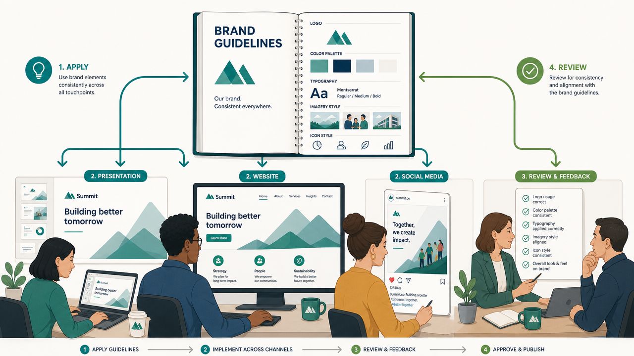
Assemble the Brand Guideline Document
Once strategy, visuals, voice, and imagery are defined, the job shifts from deciding to packaging. At this stage, many teams overbuild. They produce a beautiful document that's hard to update, hard to search, and too abstract for daily use.
A practical baseline includes at least five core sections: brand story, logo rules, color palette, typography, and contact information, and modern versions often expand to include mission, voice, imagery, and usage rules. Current guidance also reflects the shift from static PDFs to searchable digital brand systems, as outlined in Brandkit's overview of what to include in brand guidelines.
Choose a format people will open
PDFs still have a place. They're portable, easy to send to partners, and fine for fixed reference material. But they age badly. The minute someone updates a logo file or changes a color spec, the old PDF keeps circulating.
A web-based brand hub works better when:
- Multiple teams need access
- You update assets regularly
- Agencies or freelancers need current files
- You want one source of truth instead of version chaos
The strongest setup is often both. Keep a concise PDF for onboarding or external sharing, then maintain the living version in a digital workspace your team can search and update.
A smart addition is an applications section. Don't just define the brand in theory. Show it in use across slide decks, email headers, landing pages, paid ads, packaging, and social formats. If your team creates content for multiple channels, keep current platform references close at hand. For example, a practical resource like social media image sizes by platform helps teams adapt templates without guessing at dimensions.
Brand Guideline Essential Checklist
| Component | What to Include |
|---|---|
| Brand foundation | Mission, vision, values, audience, market position |
| Brand story | Short narrative on who you are, what you do, and why it matters |
| Logo rules | Primary and secondary versions, spacing, minimum size, misuse examples |
| Color palette | Primary and supporting colors with production-ready values |
| Typography | Typefaces, hierarchy, weights, spacing, and fallback usage |
| Voice | Personality traits, writing principles, vocabulary preferences, tone shifts |
| Imagery | Photography, illustration, icon style, and avoidance rules |
| Applications | Examples across digital, print, social, advertising, and packaging |
| Contact information | Brand owner, design lead, approval contact, asset access details |
Check this first: If a non-designer can't find the right file, right rule, or right person in under a few clicks, the document needs simplification.
Structure matters more than length
Keep the order intuitive. Strategy first. Identity next. Voice and imagery after that. Applications and governance near the end. Contact details last.
Don't hide critical specs inside long paragraphs. Use callouts, example panels, file links, and clear section labels. People rarely read brand guidelines front to back. They scan for answers while they're working.
Implement Rollout and Governance Procedures
Many treat brand guidelines as a completion milestone. Publish the document, share the link, move on. That's the mistake.
The hard part isn't making the guide. The hard part is keeping it alive while marketing priorities, channels, vendors, and content volumes keep changing.
Shopify highlights a major gap in common brand guidance: teams often know what assets to document, but not who updates the guide, how often it should change, what triggers a revision, and how to enforce compliance without slowing execution, as discussed in Shopify's brand-guidelines article.
Assign ownership before drift starts
Every guideline system needs a clear owner. Not a vague “marketing team” owner. A named person or role.
That owner is responsible for:
- Approving changes
- Maintaining asset libraries
- Answering interpretation questions
- Coordinating updates across teams
- Recording exceptions that become permanent rules
In smaller companies, this might be the head of marketing. In larger teams, it might be a brand manager or creative director. What matters is clarity.
Then create local responsibility. Sales ops should know who manages deck templates. Social should know who owns platform adaptations. Product marketing should know how launch exceptions get reviewed. Governance works when central ownership and channel-level responsibility meet in the middle.
Build an exception process
Rigid rules get ignored. Loose rules get bent until they disappear. You need a middle path.
Document a simple exception workflow:
- The requester explains what they want to change and why.
- The brand owner reviews whether it solves a one-off need or reveals a gap in the current guidelines.
- Approved exceptions are logged.
- Repeated exceptions trigger a guideline update.
This keeps teams moving without turning the brand into a free-for-all.
If people keep asking for the same exception, the problem usually isn't compliance. The problem is that the guide no longer reflects the way the business actually creates content.
A practical way to support rollout is to pair the launch with short enablement. Walk sales through the new deck rules. Show freelancers where approved assets live. Give social managers examples of compliant posts and edge cases. Teams are far more likely to follow standards they've seen applied than standards they've only been emailed.
If you're also formalizing AI use, it helps to document the tools your team is allowed to use and where brand checks happen in the workflow. A resource like this guide to AI content creation tools can help marketing teams think through tool roles before they lock policy into the brand system.
Apply Guidelines to AI and Repurposed Content
At this point, static guidance starts to break down.
One blog post becomes a LinkedIn carousel, an Instagram graphic, a short video, an email teaser, and a quote card. Then AI enters the process and generates multiple variants in minutes. Speed goes up. Drift goes up with it.
Figma's recent guidance highlights a modern problem many older brand manuals barely address: how to keep AI-generated and repurposed content aligned with the brand across Instagram, LinkedIn, and TikTok when teams are producing assets under pressure, as noted in Figma's AI brand guideline generator page.
Translate brand rules into production rules
This is the shift organizations need to make. Your guidelines can't just describe the brand. They need to instruct systems and creators how to apply it repeatedly.
For AI and repurposing workflows, turn broad standards into clear inputs:
- Voice rule: “Direct and expert” becomes sentence-length guidance, vocabulary preferences, and phrases to avoid.
- Visual rule: “Clean and modern” becomes layout density, image treatment, logo placement, and background preferences.
- Platform rule: LinkedIn captions can be more substantive. TikTok hooks may be shorter and more immediate.
- Repurposing rule: A webinar transcript should not be pasted raw into every channel. It needs approved transformations.
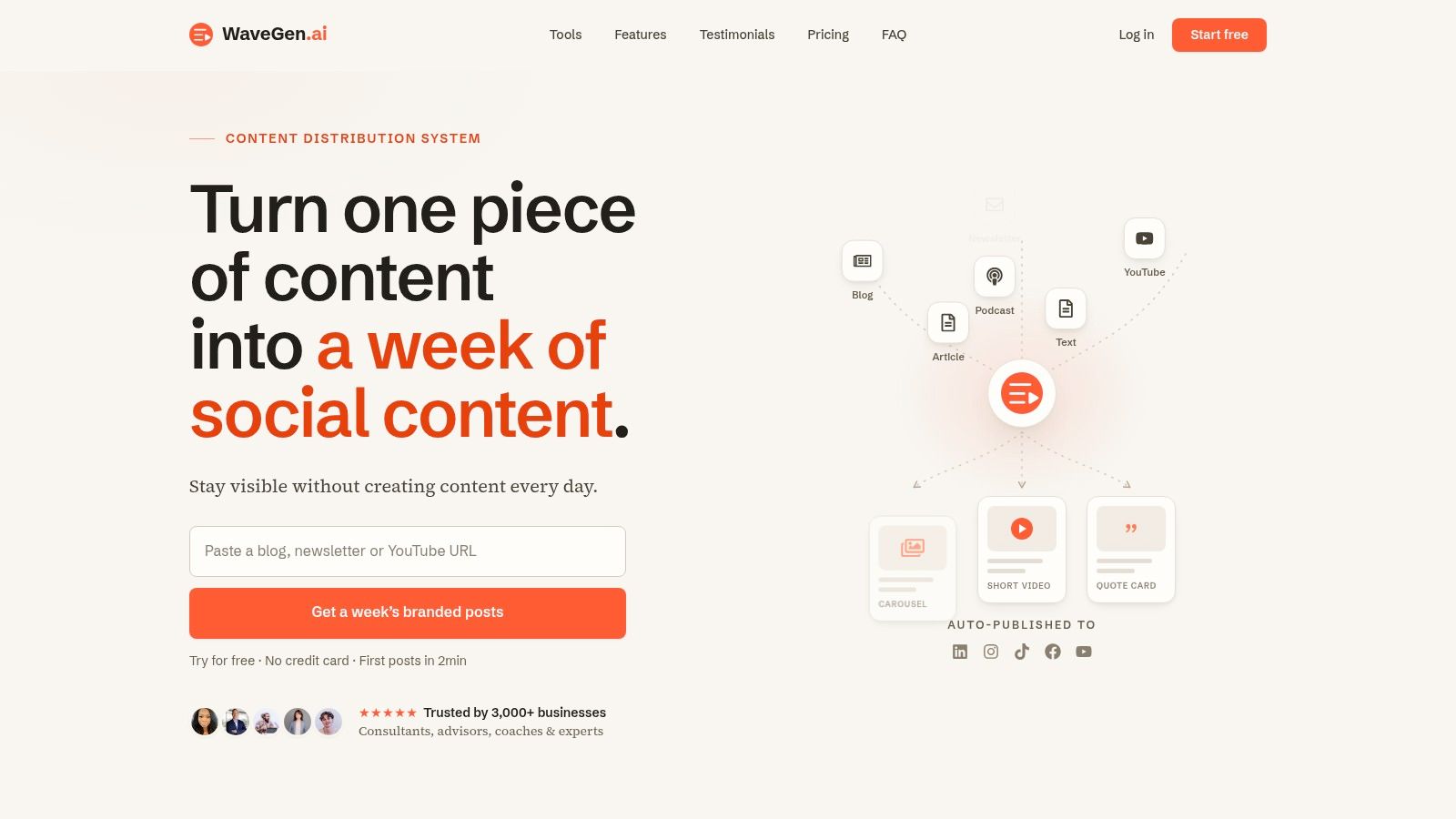
A tool can operationalize the work. For example, WaveGen.ai's AI content repurposing workflow lets teams set a brand profile with colors, fonts, logo, and voice so repurposed assets stay aligned as long-form content is turned into social formats. That doesn't replace strategy. It applies it faster.
What to document for AI workflows
Most brand guides need an extra layer for AI use. Add rules such as:
- Prompt boundaries: What the AI should emphasize, and what it should avoid inventing.
- Caption style: Length range, use of emojis, hashtag style, punctuation preferences.
- Image direction: Acceptable subjects, framing, text overlays, and brand-safe visual treatments.
- Review points: What a human checks before publishing.
- Channel adaptations: What changes by platform, and what never changes.
The best test is simple. If a contractor, coordinator, or AI system received only your documentation, could they produce content that feels recognizably yours?
If the answer is no, your guidelines are still decorative.
Brand guidelines now need to work at the speed of content operations. That means they must be accessible, specific, and structured well enough to survive repurposing, delegation, and automation. Once they do, they stop being a reference file and start acting like infrastructure.
If you're turning articles, newsletters, podcasts, or transcripts into social content regularly, WaveGen.ai gives you a way to apply brand kits in production instead of relying on manual fixes after the fact. You set your colors, fonts, logo, and voice once, then generate platform-specific assets from existing content while keeping the output aligned to the same system.
brand guidelines
brand identity
style guide
content marketing
brand consistency
Turn this kind of writing into a week of social content.
Paste a blog post, newsletter, or rough draft — WaveGen turns it into publish-ready carousels, captions, and slideshows for every channel.
No credit card · First posts in 2min