July 1, 2026
15 min read
Visual Content Creation: Master Visuals in 2026
Learn fundamentals of visual content creation in 2026. Guide covers types, workflows, & tools for consultants & small teams to create engaging visuals.
You know the pattern. A solid blog post goes live on Tuesday. By Wednesday, someone asks for a LinkedIn carousel. On Thursday, you still need an Instagram post, a short video, a quote graphic, and something for your newsletter teaser. By Friday, the original idea is still good, but the team is tired, the visuals are inconsistent, and every asset feels like it was made from scratch.
That's the core problem behind most visual content creation bottlenecks. It isn't a lack of ideas. It's a lack of system design.
Small teams usually don't fail because they can't write. They fail because production keeps resetting to zero. Each platform asks for a different shape, pace, and style. Each asset needs copy, layout, formatting, and review. Without a repeatable workflow, visual content turns into daily manual labor.
That pressure is happening inside a much larger shift. The broader digital content creation market reached USD 36.39 billion in 2025 and is projected to reach nearly USD 87.76 billion by 2032 at a 13.4% CAGR, reflecting a move toward professional workflows that prioritize accuracy, originality, and performance tracking through AI-driven analytics, according to Maximize Market Research on the digital content creation market. In practice, that means casual posting habits are being replaced by production systems.
If your team also manages product visuals, the same logic applies. A useful example is MerchLoom for product image consistency, which shows how standardization reduces one-off design work. Social content needs that same operational mindset.
Table of Contents
- The Content Treadmill and How to Get Off
- What Is Visual Content and Why It Dominates
- The Key Types of Visual Content to Master
- Building Your Strategic Visual Creation Workflow
- Smart Repurposing From One Idea to a Week of Content
- Measuring Success and Optimizing Your Visuals
- Frequently Asked Questions about Visual Content Creation
The Content Treadmill and How to Get Off
A consultant writes thoughtful content every week but still feels behind. One day goes to writing. Another goes to pulling quotes. Then comes formatting slides, resizing graphics, editing captions, and trying to make LinkedIn, Instagram, and YouTube all sound native. Nothing is technically broken. The process is.
Most teams call this a content problem when it's really a production problem. They're treating visual content creation like a series of separate creative events instead of one repeatable operating system.
What the treadmill actually looks like
The treadmill has a few familiar symptoms:
- Too many fresh starts: Every post begins with a blank page or blank canvas.
- Manual resizing everywhere: One message gets reformatted again and again for different platforms.
- Brand drift: Fonts, colors, hooks, and tone change depending on who made the asset.
- Publishing gaps: Strong long-form content exists, but there's no reliable path to turn it into visuals.
Practical rule: If you need to “come up with content” every day, your workflow is forcing creativity to do production's job.
The better model is a content machine. One core idea goes in. Multiple platform-native assets come out. Review happens once at the system level, not from scratch on every post.
What getting off the treadmill requires
You need three things working together:
- A source-first mindset so the team starts with one substantial idea.
- Templates and rules so visual output stays on-brand without design reinvention.
- Distribution discipline so publishing doesn't depend on someone finding time in their spare moments.
Many small teams finally get relief. They stop asking, “What should we post today?” and start asking, “What can this source asset become?”
That shift sounds small. Operationally, it changes everything.
What Is Visual Content and Why It Dominates
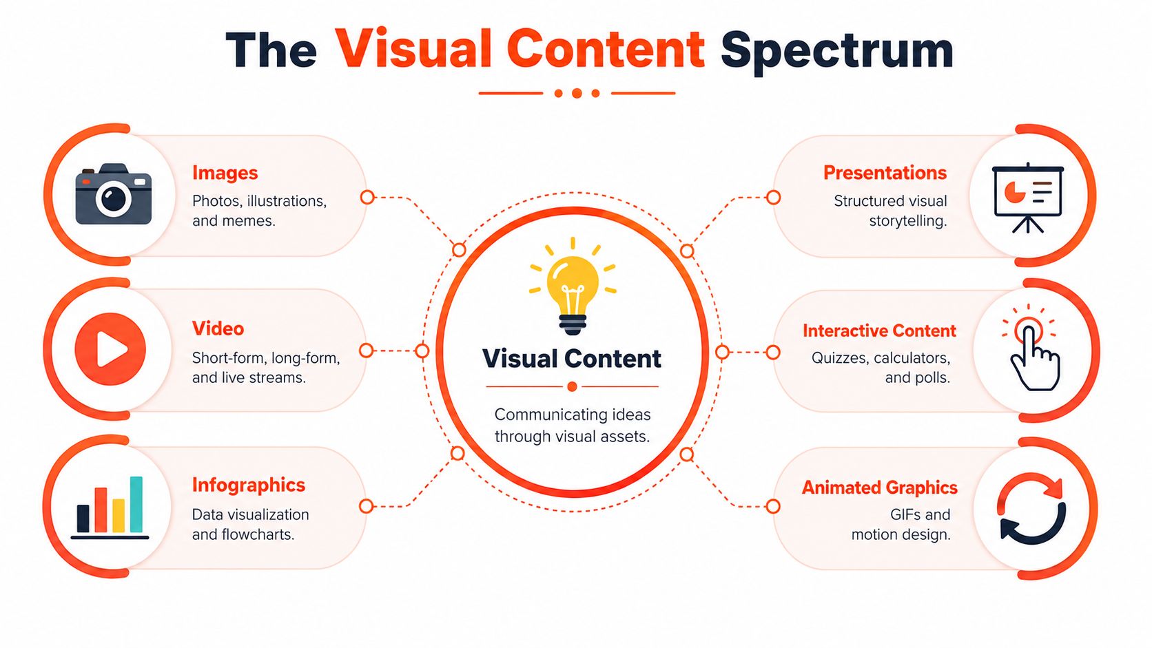
Visual content creation isn't just making pretty graphics. It's the process of turning an idea into assets people can understand quickly, remember easily, and engage with across channels. That includes static images, short-form video, carousels, infographics, presentations, quote cards, screenshots, animated graphics, and interactive formats.
What matters is not the format itself, but the job it does. Some visuals stop the scroll. Others teach. Others build credibility or move someone toward a click, a reply, or a booking.
The format range is wider than most teams use
A lot of teams stay trapped in two formats: stock-photo posts and the occasional video. That leaves a lot of potential untouched.
A more complete visual mix includes:
| Format | Best use | Typical strength |
|---|---|---|
| Carousel | Teach a sequence or framework | High dwell time |
| Short video | Deliver one sharp idea fast | Reach and shares |
| Quote card | Emphasize a memorable line | Authority and saveability |
| Infographic | Simplify a process or comparison | Clarity and reuse |
| Annotated screenshot | Explain a tool or workflow | Practical trust |
| Presentation-style visual | Tell a structured story | B2B education |
Why visuals outperform text-only posting
Visuals dominate because they reduce friction. People scan before they commit. A well-structured visual helps them understand the value before they invest full attention.
The performance gap is not subtle. Articles with images get 94% more views than text-only content, and social video posts generate 1,200% more shares than text and image posts combined, according to Sproutworth's visual content marketing statistics. That same source projects the global visual content market will reach $58.45 billion by 2035 at a 16.61% CAGR.
Visuals don't replace strong ideas. They make strong ideas easier to consume.
That's why visual content creation now sits at the center of modern publishing. It's not decoration layered onto strategy. It's part of how strategy gets delivered.
For consultants, coaches, and small B2B teams, this matters because buyers rarely encounter your message in one sitting. They see fragments. A clip on one platform. A slide on another. A quote in a feed. If those fragments are clear and consistent, they accumulate trust. If they're random, they create noise.
The Key Types of Visual Content to Master
You don't need to master every format. You need a compact set addressing the main jobs in your funnel and fitting your team's bandwidth. For most small teams, five types do the heavy lifting.
Carousels for teaching
Carousels are one of the best formats for breaking a complex idea into steps, myths, mistakes, or contrasts. They work well when your audience needs progression, not just a headline.
Use carousels when you want to:
- Explain a framework: Turn one article section into slide-by-slide teaching.
- Debunk confusion: A myth-versus-reality sequence works well here.
- Create saves: Useful reference material gets revisited.
LinkedIn and Instagram are the obvious homes, but the logic is broader. If your message benefits from controlled pacing, a carousel is usually stronger than a single image. For teams comparing options, social media content types for different goals is a useful reference point.
Short-form video for attention and clicks
Short video is the format to use when the idea can be reduced to one punchy insight, one reaction, or one fast explanation. It doesn't need a full lesson. It needs a clean point and a strong opening line.
What works:
- Hook with the problem first.
- Keep one idea per clip.
- Use on-screen text so the message survives muted playback.
What doesn't work:
- Turning a blog post into a rambling monologue.
- Packing five points into thirty seconds.
- Treating every video like a mini webinar.
Quote cards for authority
Quote cards are simple, but they're easy to misuse. They work when the line is sharp enough to stand alone and specific enough to sound earned. Generic motivation tends to disappear in the feed.
A good quote card usually comes from:
- A contrarian line in your article
- A client-safe observation
- A useful distinction your audience repeats back
A quote card should sound like a real belief, not a placeholder sentence from a content calendar.
LinkedIn is usually the strongest fit because the format supports point-of-view publishing.
Infographics for simplification
Infographics are useful when your audience needs to see a process, comparison, or relationship. They're especially effective for service businesses that sell expertise people find hard to visualize.
They work best for:
- Decision trees
- Before-and-after workflows
- Mistake-to-solution maps
- Process summaries
The trap is overdesign. If the infographic needs a presentation to explain it, it has failed. One clear visual idea is enough.
Screenshots and visual proof for trust
When you're teaching a workflow, screenshots often outperform polished graphics because they feel concrete. Annotated screenshots show the actual environment, not an abstract representation of it.
Use them when you need to:
- Walk through a tool
- Show a content setup
- Explain a dashboard or publishing process
This is especially useful for agencies, educators, and software-adjacent teams. A screenshot says, “Here's how this looks in practice,” which is often more persuasive than a designed summary.
Building Your Strategic Visual Creation Workflow
Most content teams don't need more ideas. They need a workflow that stops good ideas from dying as single-use posts. The strongest visual systems start with one source asset and build outward from there.
A documented strategy is part of that difference. 65% of top content marketers have a documented strategy, compared with 14% of less successful ones, and creators who repurpose their own long-form content into multiple visual angles see 3x higher engagement than those using generic AI visuals, according to Acquia's guide to visual content marketing.
Start with one strong source asset
The source asset is the most impactful part of the whole system. It can be a blog post, newsletter, podcast transcript, webinar outline, or YouTube script. What matters is that it contains enough substance to split into multiple angles.
A weak source asset produces weak repurposing. If the original piece is vague, every downstream visual becomes a dressed-up version of vague.
Use this filter before you repurpose anything:
| Question | Why it matters |
|---|---|
| Does it solve a real buyer problem? | Relevance drives engagement |
| Does it connect naturally to your offer? | Commercial fit keeps content useful |
| Can it be broken into distinct sub-points? | Repurposing needs clean angles |
| Does it contain language worth quoting? | Strong phrasing becomes visual copy |
If your team uses AI in the workflow, keep its role narrow and practical. Research support, summarization, draft formatting, and caption variations are useful. Final judgment still needs a human editor. For a broader array of tools, this list of best AI tools for content creation is helpful for comparing categories.
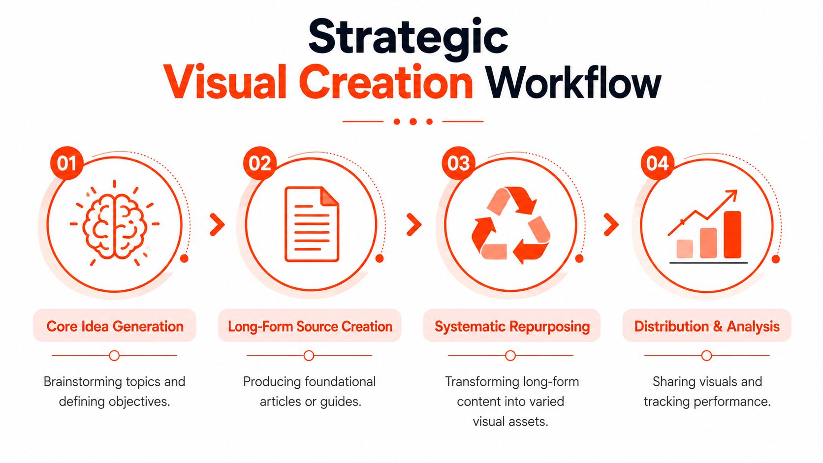
Build the workflow in four stages
The system itself is straightforward. The discipline is in using it every week.
Core idea selection
Choose one topic with real audience tension. Not “productivity tips.” Something sharper, like a common mistake, false assumption, or hidden cost your audience keeps running into.Long-form source creation
Write or record the full idea once. Depth is inherent in this process. The more structured your source piece is, the easier every visual derivative becomes.Systematic repurposing
Split the source into platform-native assets. One section becomes a carousel. A punchy line becomes a quote card. One argument becomes a short video script. One process becomes an infographic.Distribution and review
Schedule assets as a batch, then review performance at the campaign level instead of judging each post in isolation.
Operational advice: Build once at the idea level. Adapt at the format level. Don't rewrite the strategy every time you resize the canvas.
For teams that want to reduce repetitive formatting work, content creation automation workflows are worth studying. One practical option is WaveGen.ai, which turns a source article, newsletter, script, or transcript into on-brand social assets with platform-specific formatting. The relevant point isn't the tool itself. It's the operating model: source-first, template-backed, and distribution-aware.
Smart Repurposing From One Idea to a Week of Content
Repurposing sounds obvious until you try to do it under deadline. Then the bottleneck appears. The source article exists, but someone still has to cut it into angles, write hooks, resize layouts, adjust captions, and make each version fit the platform without losing the original message.
That's why so many solo operators and small teams burn out on visual content creation. A common challenge is staying consistent across different platform formats, and 78% of solo creators and 62% of small marketing teams report burnout tied to inconsistent visual output and the manual effort involved, according to LinkedIn's content creation techniques discussion.
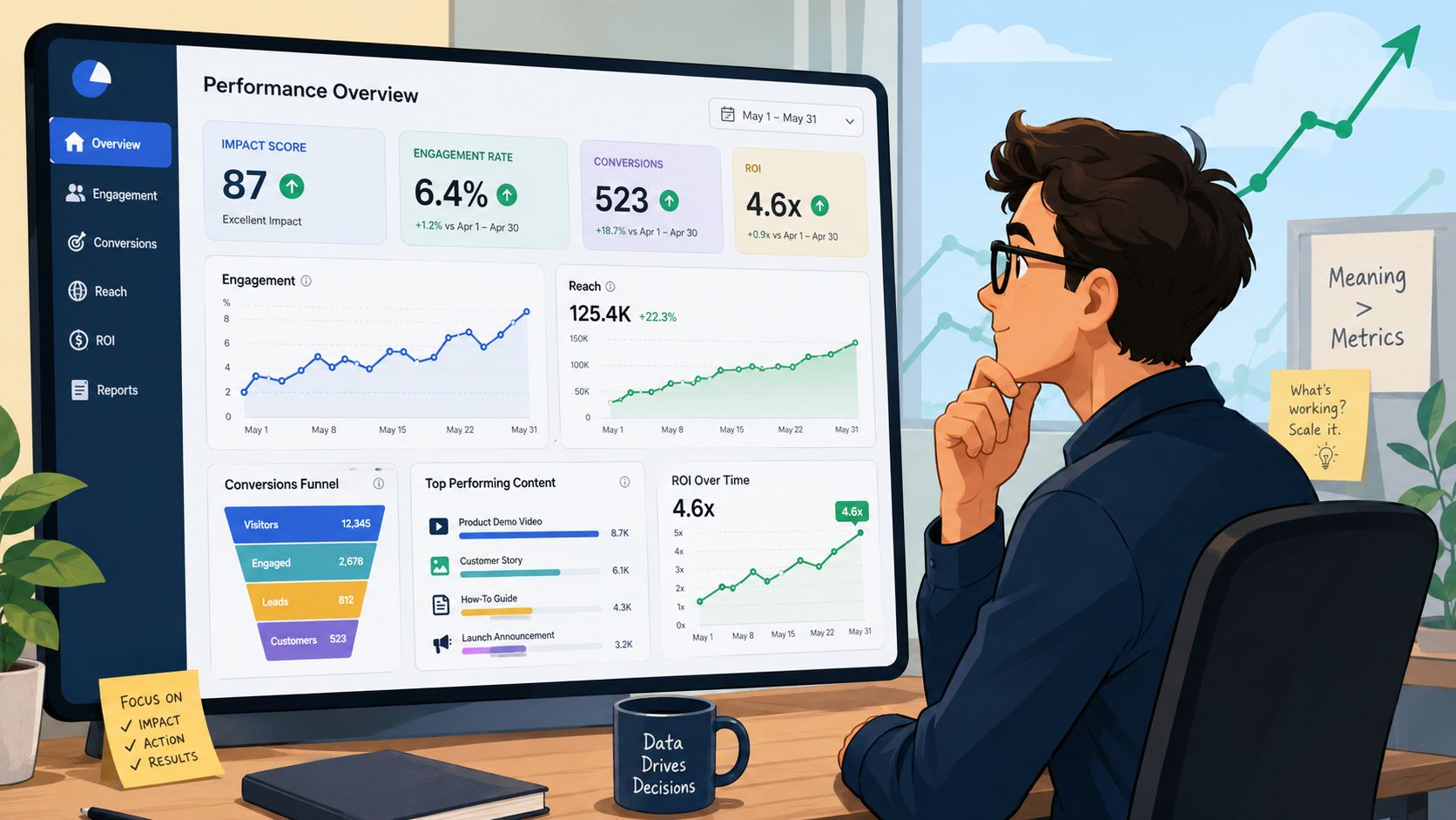
Here's what a practical repurposing setup can look like inside a real interface:
A practical weekly breakdown
Take a source article called “5 Time Management Myths for Consultants.” That single piece can produce a full week of visual assets without inventing five new topics.
Monday: Instagram or LinkedIn carousel
One slide per myth. Final slide gives the corrected principle. This works because the source already has structure.Tuesday: Quote card
Pull the sharpest line, something like the core mistake behind bad scheduling habits. Keep the text short and visually clean.Wednesday: Short-form video
Use one myth as the hook. Script it as a fast explanation, not a summary of the whole article.Thursday: LinkedIn image post
Turn one lesson into a strong opinion plus a simple supporting visual.Friday: Infographic or static framework
Convert the five myths into a one-page reference graphic for saves and reposts.
Tools built for repurposing can help here. If you're evaluating options specifically for pipeline design, this guide to AI content repurposing tools is a good starting point.
Where most teams get stuck
The hard part isn't finding five outputs. It's keeping them coherent.
Manual workflows usually break in the same places:
- Message drift: Each asset starts saying something slightly different.
- Design inconsistency: Colors, type hierarchy, and spacing change from post to post.
- Platform mismatch: The same copy gets shoved into formats that require different pacing.
- Review drag: Every asset triggers a fresh round of edits because there was no shared system upstream.
A quick walkthrough helps make the logic concrete:
The fix is to decide the transformations in advance. Before design begins, mark the source content by function: quote-worthy lines, teachable steps, one-video hooks, and infographic-ready structures. Then your visuals become conversions of planned raw material, not improvised rescue work.
The fastest teams don't create more often. They extract more value from each original idea.
Measuring Success and Optimizing Your Visuals
A lot of visual programs look active and still don't help the business. Posts go out. Likes appear. Comments trickle in. Nothing meaningful changes downstream. That usually happens when the team tracks applause instead of decisions.
Track business signals, not applause
The useful question is not “Did people react?” It's “Did this format move someone closer to action?”
For most consultants and small teams, the most useful visual KPIs are:
- Engagement quality: Saves, shares, thoughtful comments, and replies usually tell you more than lightweight likes.
- Traffic intent: Clicks to a blog post, lead magnet, booking page, or service page show whether the content creates movement.
- Lead contribution: Track which content themes and formats appear before inquiries or consultation bookings.
- Format role: Know which assets attract attention and which ones convert it.
A carousel may earn strong engagement but weak clicks. A short video may produce fewer comments and more profile visits. Both can be valuable if you know their job.
Create a fast feedback loop
Speed matters here. Integrating real-time data pipelines with visualization tools can reduce KPI tracking latency by 58% and increase conversion efficiency by 30% when teams use a structured measurement habit, according to ReachLabs on visual content creation and measurement.
That matters because old reporting habits make teams optimize too late. They keep producing weak formats for weeks because no one sees the pattern quickly enough.
Use a simple review rhythm:
- Check performance by format.
- Check performance by topic.
- Compare engagement metrics with click or lead behavior.
- Adjust the next batch, not just the next post.
Measurement rule: Every visual asset should have one primary job. Attraction, education, or conversion. If you can't name the job, you can't judge the result.
When this is working, optimization becomes calm. You stop guessing which visuals matter and start scaling the ones that earn a real response.
Frequently Asked Questions about Visual Content Creation
What are the best budget-friendly tools for non-designers
Start with a stack that covers writing, layout, and scheduling without adding complexity. Canva is still useful for template-based design. CapCut works for quick short-form editing. A scheduling tool helps keep publishing consistent. If you want to compare a workflow built around creator assets and social output, Understanding UGC Copilot's service is a practical example of how adjacent tools frame support for content production.
The bigger issue isn't which app you choose first. It's whether your tools support a repeatable system instead of isolated tasks.
How do I create a simple brand kit
Keep it lean. Pick one primary font pair, a small color palette, logo variations, thumbnail rules, and two or three caption voice guidelines. Then lock those into templates.
A useful brand kit should answer:
- What fonts do we use
- Which colors are primary and secondary
- What tone do captions follow
- Which layouts are approved for carousels, quotes, and promos
If the kit is too detailed, nobody uses it. If it's too vague, every asset looks different.
How much time should I allocate each week
Think in batches, not daily posting time. One block for source creation. One block for repurposing. One block for review and scheduling. That's more sustainable than touching content every day.
Teams often improve fastest when they protect one planning session and one production session each week. The exact hours depend on your approval process and how many channels you manage.
What should I do first if my workflow is messy right now
Don't start by redesigning everything. Start by picking one strong source asset from the last month and repurpose it into three visual formats. Build one small system that works, then expand.
That gives you a template library, a review process, and a clearer sense of what your audience responds to.
If you already publish articles, newsletters, podcast scripts, or video transcripts, WaveGen.ai can help turn that source content into a week of on-brand social assets with platform-specific formatting, visual templates, and scheduling in one workflow. It's a practical fit for teams that want a system for visual content creation instead of another pile of manual design tasks.
visual content creation
content marketing
social media visuals
content repurposing
small business marketing
Turn this kind of writing into a week of social content.
Paste a blog post, newsletter, or rough draft — WaveGen turns it into publish-ready carousels, captions, and slideshows for every channel.
No credit card · First posts in 2min