June 27, 2026
13 min read
What Is a Brand Kit? a Practical Guide for 2026
Wondering what is a brand kit and why you need one? This guide explains the core components, benefits, and how to create one to ensure brand consistency.
You publish a blog post. Then you turn it into a LinkedIn post, an Instagram carousel, a short video script, and a quote card for your newsletter. By Friday, each asset says roughly the same thing, but they don't feel like they came from the same business.
The colors drift. The fonts change. One caption sounds warm and conversational, another sounds like a legal memo. A contractor uses an older logo file. An AI tool writes in a tone that's technically fine but obviously not you. Nothing is broken on its own. Together, it creates friction.
That's usually the moment people ask, what is a brand kit, really? Is it just a folder with logos? A PDF your designer made last year? A style guide no one opens unless there's a problem?
A useful brand kit is much more than that. It gives your team a shared reference point for how your brand should look, sound, and show up across every channel. And in an AI-heavy workflow, that old static version of a brand kit often isn't enough anymore.
Table of Contents
- Your Brand Everywhere All at Once (and All a Mess)
- What Is a Brand Kit Really
- The Anatomy of a Complete Brand Kit
- Why a Brand Kit Is a Must-Have Not a Nice-to-Have
- Building Your Brand Kit Step by Step
- From Static Guide to Active Enforcer
Your Brand Everywhere All at Once (and All a Mess)
A lot of businesses don't notice brand inconsistency until they look at all their content side by side.
Your Instagram graphics feel bright and casual. Your LinkedIn posts read formal and polished. Your slide deck uses one version of the logo, while your email header uses another. Someone on your team makes a quote card in Canva with a color that's close to your brand color, but not precisely your brand color. Each piece looks acceptable in isolation.
The problem shows up when a client sees all of it in one week. Instead of getting a clear impression, they get mixed signals. Are you premium or playful? Direct or nurturing? Modern or traditional? The message gets blurred.
A messy brand rarely looks chaotic to the team making it. It looks chaotic to the audience seeing the full pattern.
This gets harder when you publish across several platforms at once. Different dimensions, content formats, and audience expectations push teams into constant adaptation. If you work in a multi-channel content strategy, you already know the pressure. Every channel asks for a different shape of the same idea.
What usually causes the mess
Most brand inconsistency doesn't come from bad taste. It comes from scattered decisions.
- Too many source files. People grab logos from old folders, past presentations, or random desktop files.
- Unwritten voice rules. Everyone has a slightly different idea of what “our tone” means.
- Fast content cycles. Teams move quickly and choose “good enough” over “approved.”
- AI without guardrails. Tools generate content fast, but speed without standards creates drift.
A brand kit solves this by becoming the single source of truth. It tells your team, your freelancers, and your tools what “on-brand” means.
Think of it as the recipe book for your brand. Without it, every cook improvises. With it, the dish still has room for style, but it tastes like the same restaurant every time.
What Is a Brand Kit Really
A brand kit isn't just a logo pack.
A better definition is this. A brand kit is the working system that defines how your brand looks, sounds, and behaves in public. It includes the visual assets people expect, but it also includes the instructions that make those assets usable.
That distinction matters. A folder full of PNG files is storage. A brand kit is guidance.
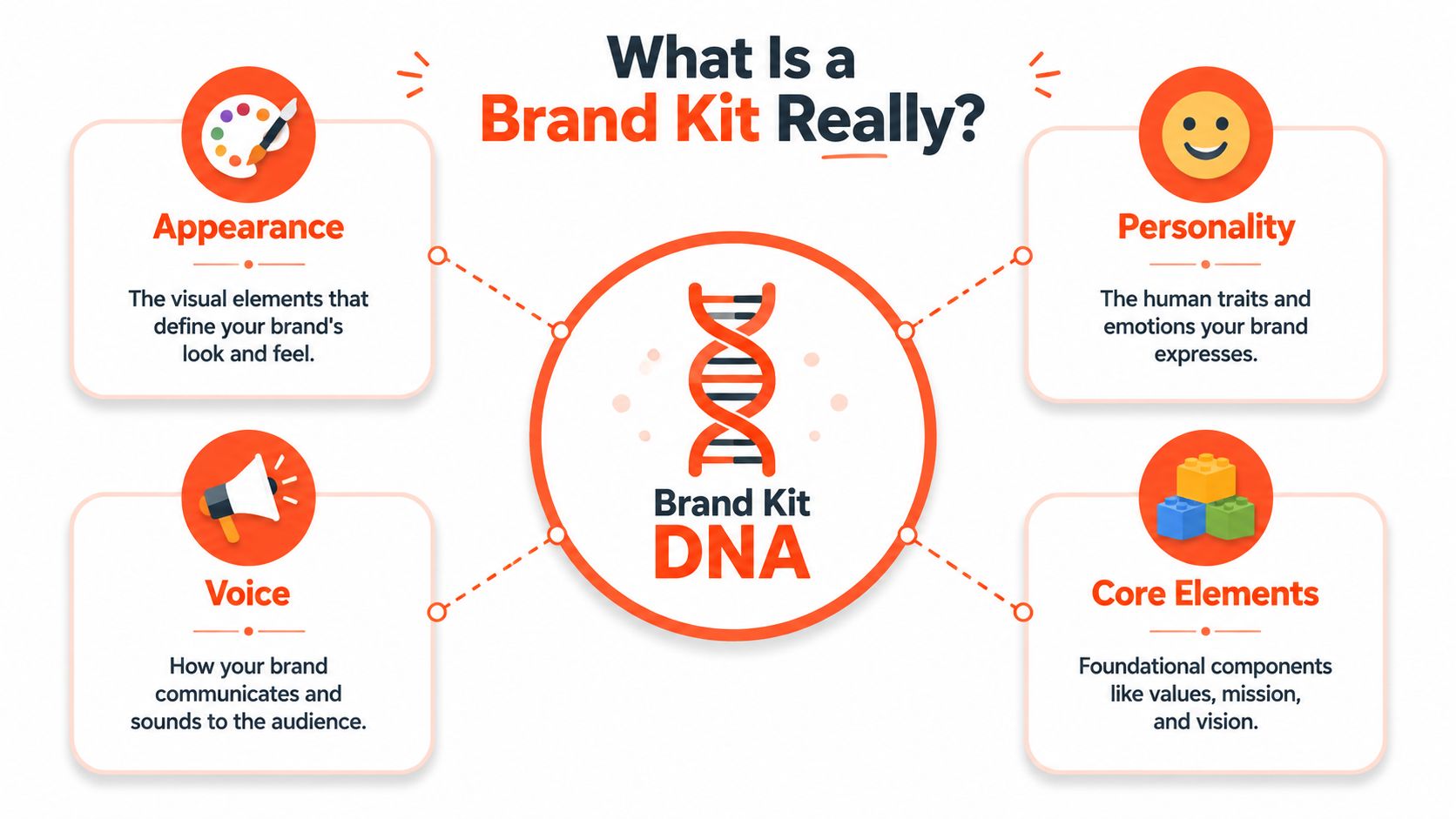
Think of it as your brand's DNA
DNA doesn't describe one body part. It contains the code for the whole organism. Your brand kit works the same way.
It usually includes your appearance, personality, voice, and core elements. Appearance covers your logo, colors, fonts, and imagery. Personality shapes the emotional feel of the brand. Voice explains how you speak. Core elements hold the deeper ideas such as mission, values, and positioning.
That's why a strong brand kit helps more than designers. Writers use it. Sales teams use it. Video editors use it. AI tools need it. If you're exploring adjacent creative systems, this round-up of AI video tools for creators is useful because it shows how many outputs now depend on consistent visual and voice rules.
What people often confuse
Here's where smart teams get tripped up.
| What it is | What it isn't |
|---|---|
| A shared operating guide | A one-time design deliverable |
| Usable rules for daily content | A polished PDF nobody checks |
| A tool for humans and systems | A mood board with no application |
| A foundation for scale | A nice-to-have afterthought |
Practical rule: If a new contractor or AI tool can't use your brand kit to produce accurate work on day one, the kit isn't finished.
The easiest way to answer “what is a brand kit” is this: it's the document or system that removes guesswork. It helps everyone make the same brand decisions, even when different people are creating different kinds of content.
The Anatomy of a Complete Brand Kit
A complete brand kit gives people enough detail to create work without having to ask basic questions every time. If your team still asks, “Which logo should I use?” or “What font goes in a carousel headline?” the kit is probably incomplete.
This is what a practical, working brand kit usually contains.
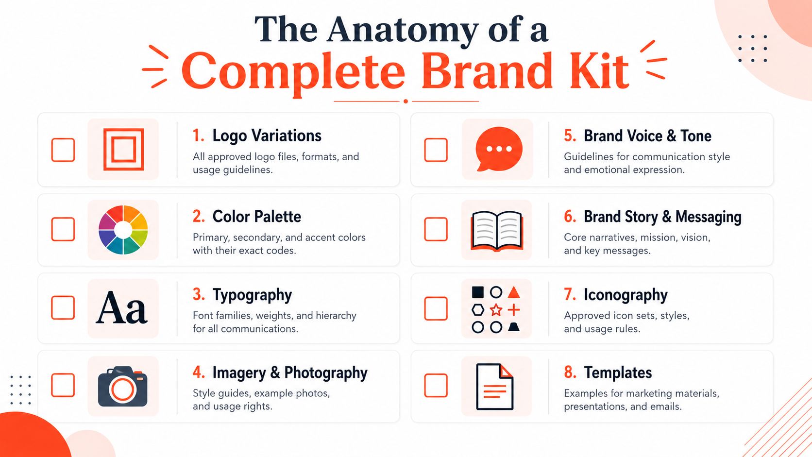
Logo suite and usage rules
A logo isn't one file. It's a set of approved versions for different contexts.
You typically need a primary logo, a secondary or stacked version, and a simple icon or mark. A good kit also shows when each version should be used. For example, a long horizontal logo may work on a website header, while a compact mark works better as a social avatar.
Include rules that answer simple but common questions:
- Spacing rules. How much clear space should sit around the logo?
- Minimum size. When does the logo become too small to read?
- Background use. Which versions work on light, dark, or photographic backgrounds?
- Misuse examples. Show what not to do, like stretching, recoloring, or adding shadows.
Color palette
Your color palette is more than “blue and orange.”
A real brand kit lists your primary, secondary, and accent colors with exact values, including hex codes. That precision matters because “close enough” is one of the fastest ways brands start looking inconsistent. A quote card built with a near-match color can feel subtly off, even if most viewers can't explain why.
You also want practical guidance. Which color should dominate? Which should appear sparingly? Which one is reserved for calls to action?
If you need a deeper working template for codifying these decisions, this guide on how to create brand guidelines is a useful companion.
A quick visual explainer helps before teams start designing:
Typography hierarchy
Typography gives your brand rhythm.
You need more than a font name. You need a hierarchy. Which font is for headlines? Which one is for body copy? What weight should captions use? Are all caps allowed in callouts? Can social graphics use a display font that your website doesn't?
Inconsistency is a common issue for many brands. One team member uses a stylish font in Canva, another defaults to Arial in a slide deck, and someone else swaps in a similar Google Font because the original isn't installed. The brand starts sounding different visually.
Brand voice and tone
Visual consistency becomes emotional consistency.
Your voice is the stable personality of the brand. Your tone shifts slightly depending on context. A law firm may always sound clear and trustworthy, but its tone on a webinar landing page might be warmer than its tone in a compliance memo.
A useful voice section includes:
- Adjectives that define the voice. For example, clear, calm, direct, encouraging.
- Words to use and avoid. This prevents drift into jargon or clichés.
- Before-and-after examples. Show how a generic sentence becomes a brand-aligned sentence.
- Context notes. Explain how the tone changes across channels without losing identity.
The easiest voice guide to follow is one that includes examples, not just adjectives.
Imagery style
Photography, illustrations, icons, and textures all shape recognition.
Some brands use crisp studio imagery. Others use documentary-style photography. Some use flat icons, others use hand-drawn illustrations. None of these choices are automatically right or wrong. What matters is consistency.
Your kit should define the broad visual feel. Is the imagery bright or muted? Staged or candid? Minimal or expressive? Human-centered or product-led? That helps a designer choose assets that fit before the work even starts.
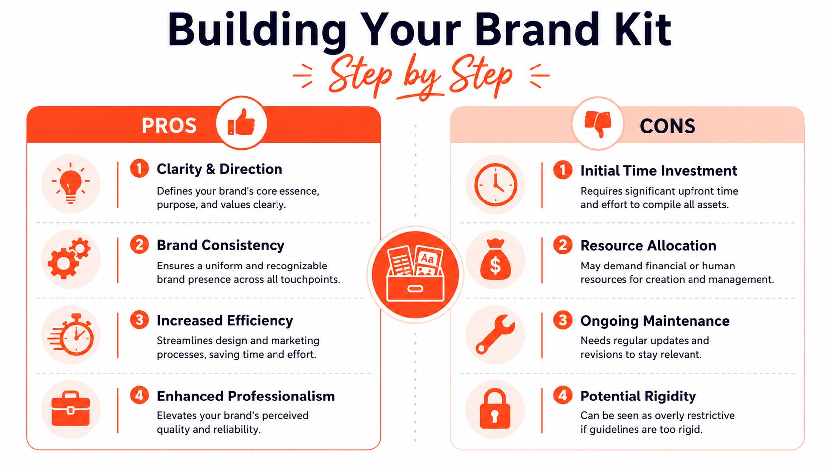
Why a Brand Kit Is a Must-Have Not a Nice-to-Have
Brand kits sometimes get treated like a finishing touch. Something you create after the “real” marketing work is done.
That's backwards. The kit is part of the infrastructure that makes marketing work repeatably.
Consistency builds recognition
When people encounter your brand across multiple channels, they make quick judgments about credibility. If the identity feels stable, the business feels stable. If it keeps changing, the business can feel improvised.
That's one reason consistency has measurable business value. Research indicates that brands with highly consistent visual presentation achieve 3.5 times higher visibility, and companies that maintain strict brand consistency see revenue growth increases of up to 23% compared to competitors who lack standardized guidelines according to QuillBot's overview of brand kit performance.
Those numbers help explain why a brand kit isn't just a design document. It influences trust, recall, and buying confidence.
Consistency also saves time
The second payoff is operational.
Without a brand kit, teams keep re-making small decisions. Which color code is correct? Which logo file is current? Does this caption sound like us? That repeated uncertainty slows down content production and creates avoidable revisions.
A centralized kit reduces that friction because everyone works from the same standard. Internal marketers, contractors, and freelance designers can move faster when they don't have to interpret the brand from scratch.
Here's the practical difference:
| Without a brand kit | With a brand kit |
|---|---|
| Repeated approval loops | Faster first drafts |
| Asset hunting across folders | Shared access to approved assets |
| Tone shifts between channels | More predictable communication |
| Inconsistent outputs from collaborators | Clearer execution across teams |
A business that publishes often can't rely on memory alone. It needs a system people can effectively use.
Building Your Brand Kit Step by Step
The first version of a brand kit doesn't need to be elaborate. It needs to be usable.
Many teams stall because they think they need a polished agency-grade document before they can begin. They don't. Start with the core decisions that remove confusion most often, then build depth over time.
Start with what should never change
Begin with the parts of your brand that should stay steady across every format.
Clarify your brand personality
Choose a small set of words that describe how the brand should feel. Not vague aspirations, unless you can define them in behavior. Better choices are words people can apply in daily work, such as calm, sharp, generous, or authoritative.Lock your visual essentials
Gather approved logos, exact color codes, and your type hierarchy. Don't leave room for interpretation where precision matters.Write the voice in plain English
Skip abstract language. Write examples. Show a social caption that sounds right and one that sounds off-brand.
If your team can't explain the brand in one minute, they won't apply it consistently in ten seconds.
Build flexible rules around the core
Once the fixed pieces are in place, add guidance for common use cases.
- Channel rules. A LinkedIn post may need a more professional opening than an Instagram caption.
- Format rules. Carousels, short videos, slides, and newsletters each need different layout and wording choices.
- Audience rules. Your brand may speak differently to enterprise buyers than to solo consultants, while keeping the same underlying personality.
Many static kits fall short; they define the brand generally, but not how it adapts in practice.
Create versions before you need them
A growing business often needs more than one active version of its brand kit. Seasonal campaigns, sub-brands, service lines, and audience segments all create variation. Without a versioning system, teams end up juggling conflicting instructions.
That problem is often underestimated. 2025 Gartner research reveals that 68% of marketers waste 12+ hours per week managing conflicting brand rules across channels because their kits lack versioning logic for things like campaigns or sub-brands, as cited in this Branded Agency analysis of brand kit essentials.
A simple versioning approach can prevent that drift:
| Core brand layer | Variable layer |
|---|---|
| Mission and values | Campaign tagline |
| Master logo family | Seasonal lockup |
| Primary color system | Limited campaign accents |
| Base brand voice | Audience-specific tone shifts |
The goal isn't to create endless exceptions. It's to define what may flex and what must remain stable.
A useful test is this. If you launch a holiday campaign or a sub-brand tomorrow, could your team produce aligned content without inventing a whole new identity on the fly? If not, your brand kit needs version logic, not just brand rules.
From Static Guide to Active Enforcer
Traditional brand kits were built for a slower workflow. A designer made the assets. A writer wrote the copy. A marketer assembled the campaign. Everyone had time to check the PDF.
That's not how many teams work now.
Why static kits break in AI workflows
AI tools can produce a week of content in minutes. That speed changes the weak point. The issue is no longer just creating content. It's controlling consistency across outputs, platforms, and formats.
When the brand kit lives as a passive document, people still have to remember and manually apply the rules. They have to resize for different platforms, rewrite captions in the right tone, and fix visuals after generation. The kit defines standards, but it doesn't enforce them.
That gap is now visible in AI workflows. WaveGen.ai-style systems that embed voice, tone, and formatting rules into the brand kit itself can reduce the manual rework of AI-generated content by 85%, solving the challenge where 72% of marketing teams currently reformat AI content by hand, according to Brandkit's discussion of dynamic brand systems.
What an executable brand kit does differently
An executable brand kit turns guidelines into working rules inside the tools that generate and distribute content.
Instead of telling a team, “Use this voice, these colors, and these dimensions,” the system applies those standards during creation. That means platform-specific formatting, tone constraints, and visual settings live inside the workflow rather than in a separate reference file.
This is the broader shift behind tools focused on automation and process control. If you want a useful outside perspective on why standardization matters before automation scales, this piece on Armox AI workflow standardization is worth reading.
One example is content creation automation for social distribution, where a source asset like a blog post or transcript gets turned into platform-ready content. In that model, the brand kit can't just describe the brand. It has to actively shape the output.
That's the practical difference between a static guide and a living system. One documents your standards. The other helps your team keep them, even when content volume rises and AI enters the workflow.
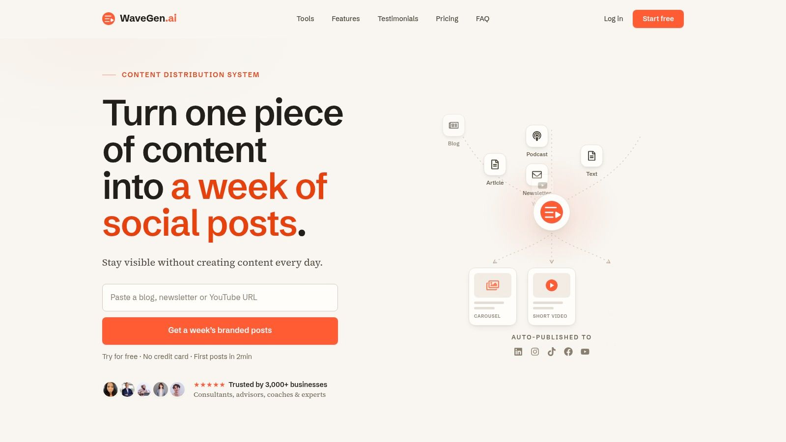
If your current brand kit lives in a PDF, a shared drive, or one designer's memory, it may be time to turn it into something more usable. WaveGen.ai lets teams set brand rules such as colors, fonts, logo, and voice inside the content workflow so social assets generated from a single source stay aligned across channels.
what is a brand kit
brand consistency
brand guidelines
content creation
WaveGen.ai
Turn this kind of writing into a week of social content.
Paste a blog post, newsletter, or rough draft — WaveGen turns it into publish-ready carousels, captions, and slideshows for every channel.
No credit card · First posts in 2min